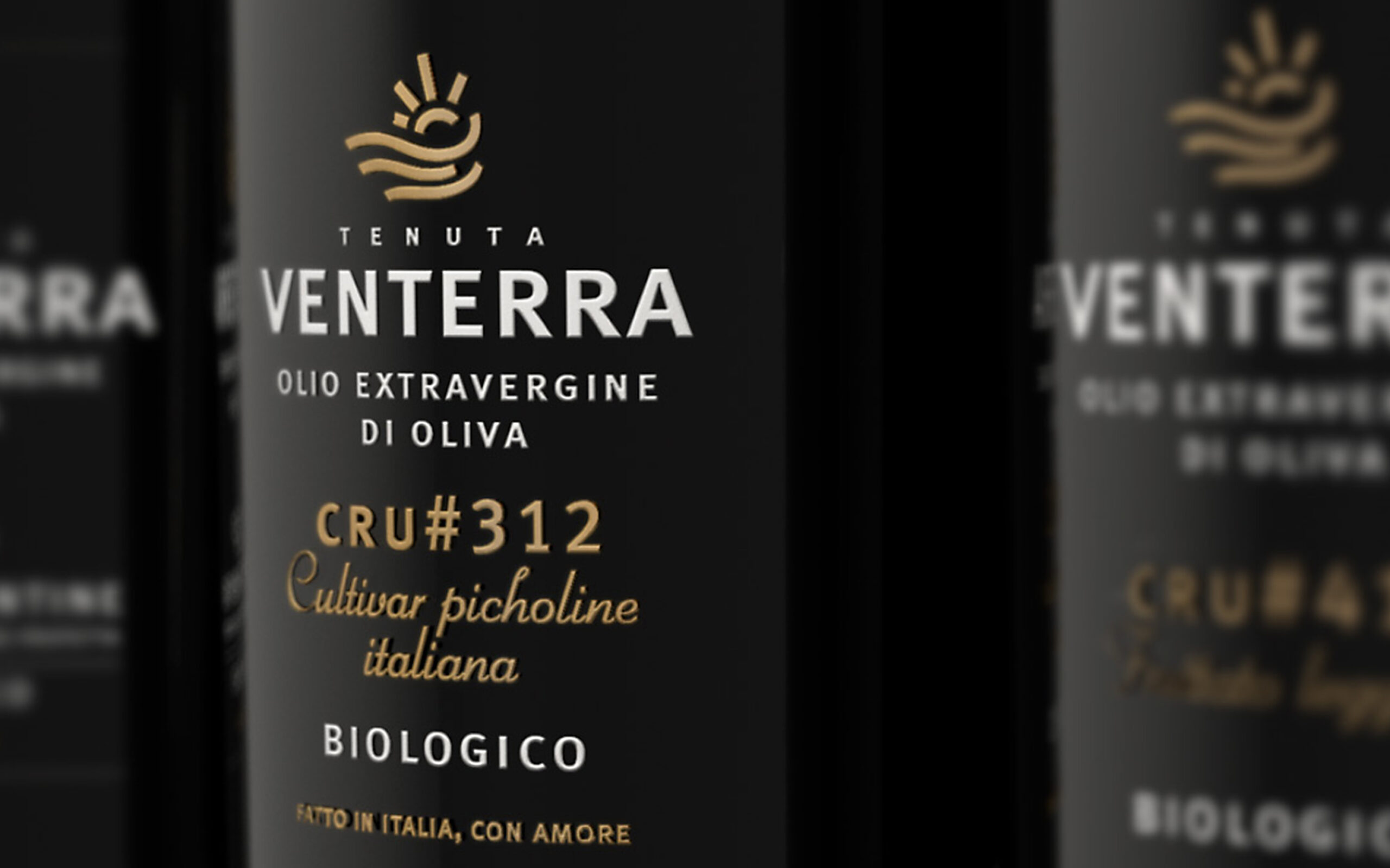
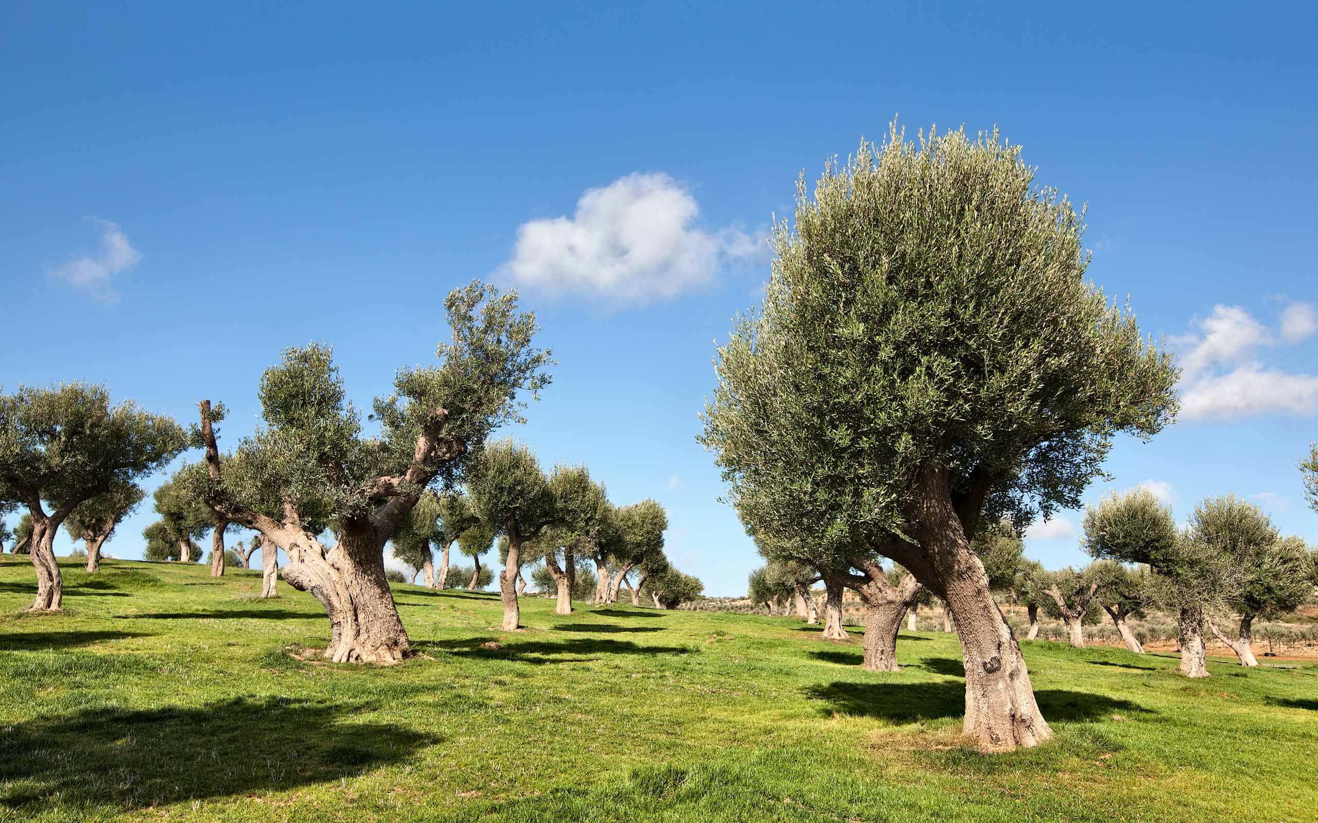
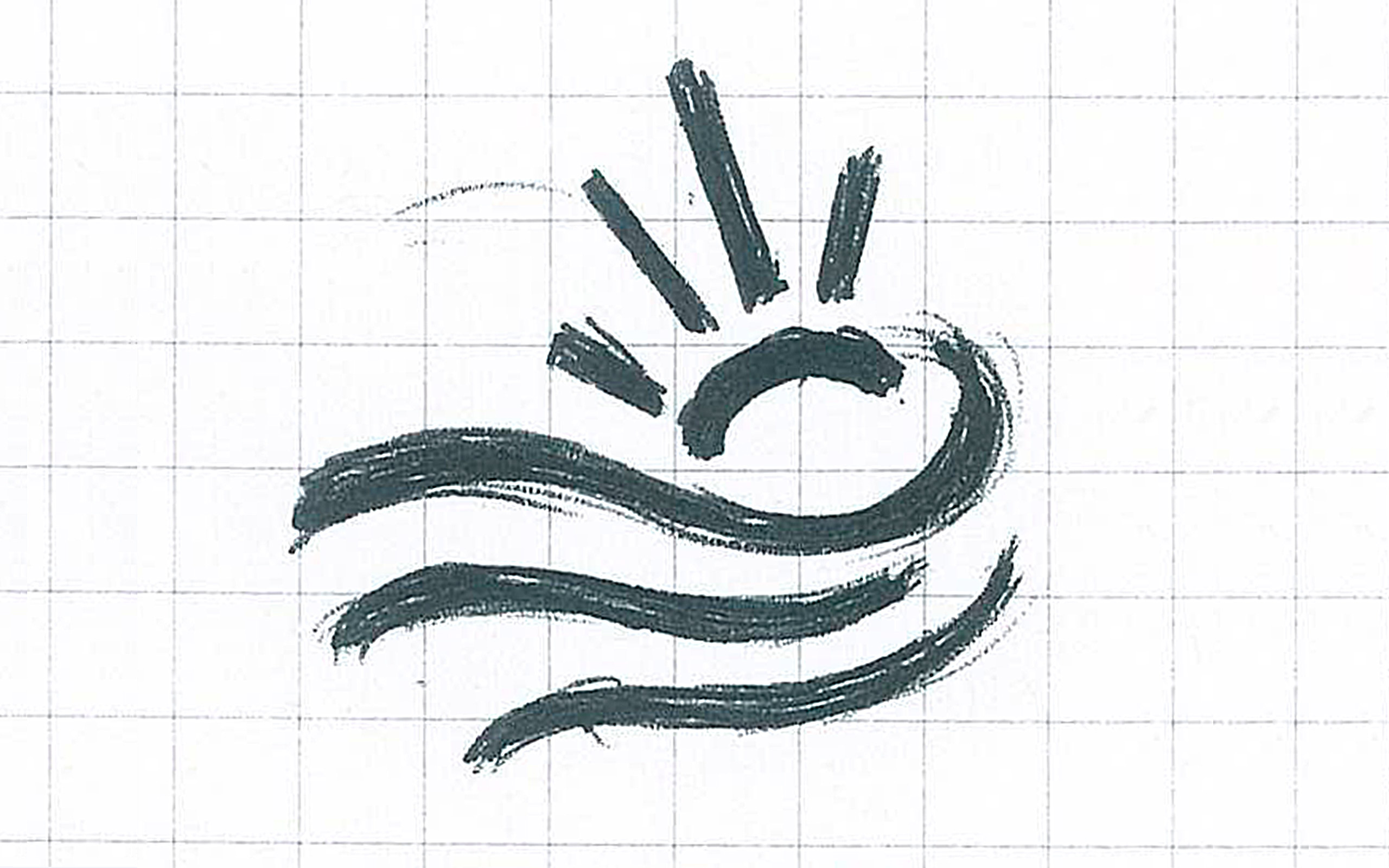
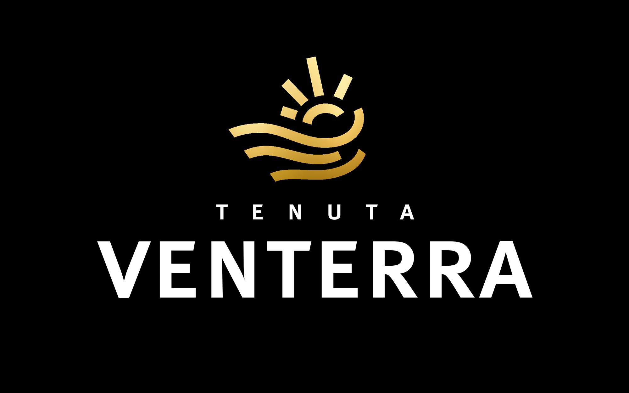
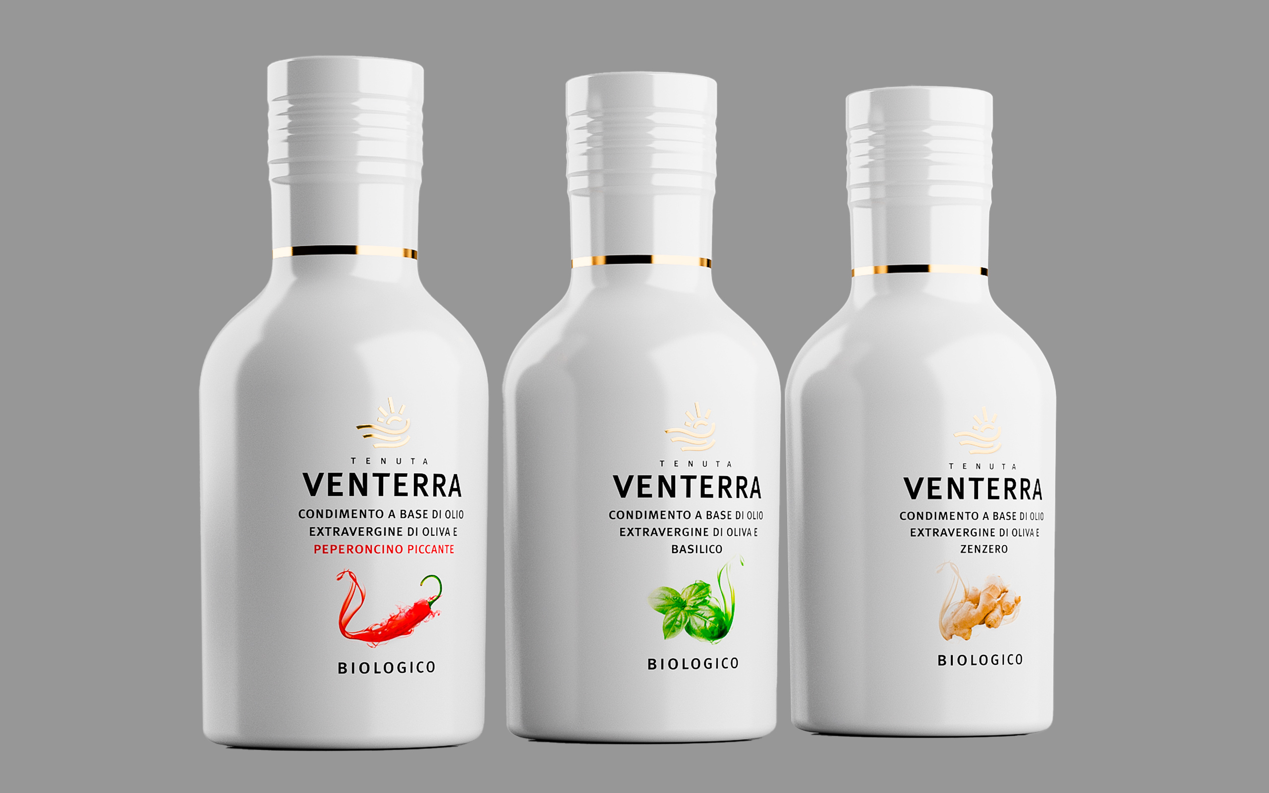
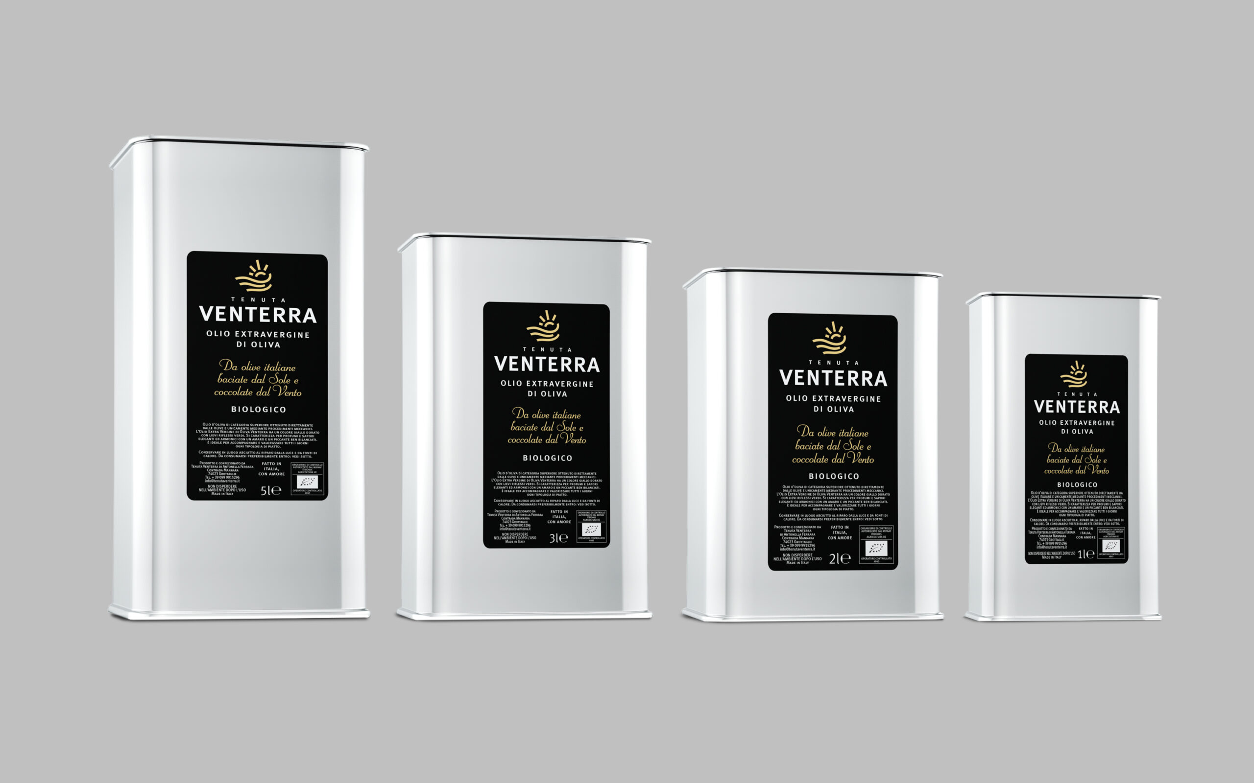
The visual identity project for Tenuta Venterra started with the name. The name Venterra was designed to emphasise the close link with the territory: ‘ven’ (wind in Italian) evokes the typical windiness of the Taranto lands while ‘terra’ (soil in Italian) suggests the fertility of the soil. The graphic sign represents four elements that tell the story of Apulia: the rays of light, the Ionian wind, the undulating ground and the waves of the sea.

What we did for this brand
Naming
Brand identity design
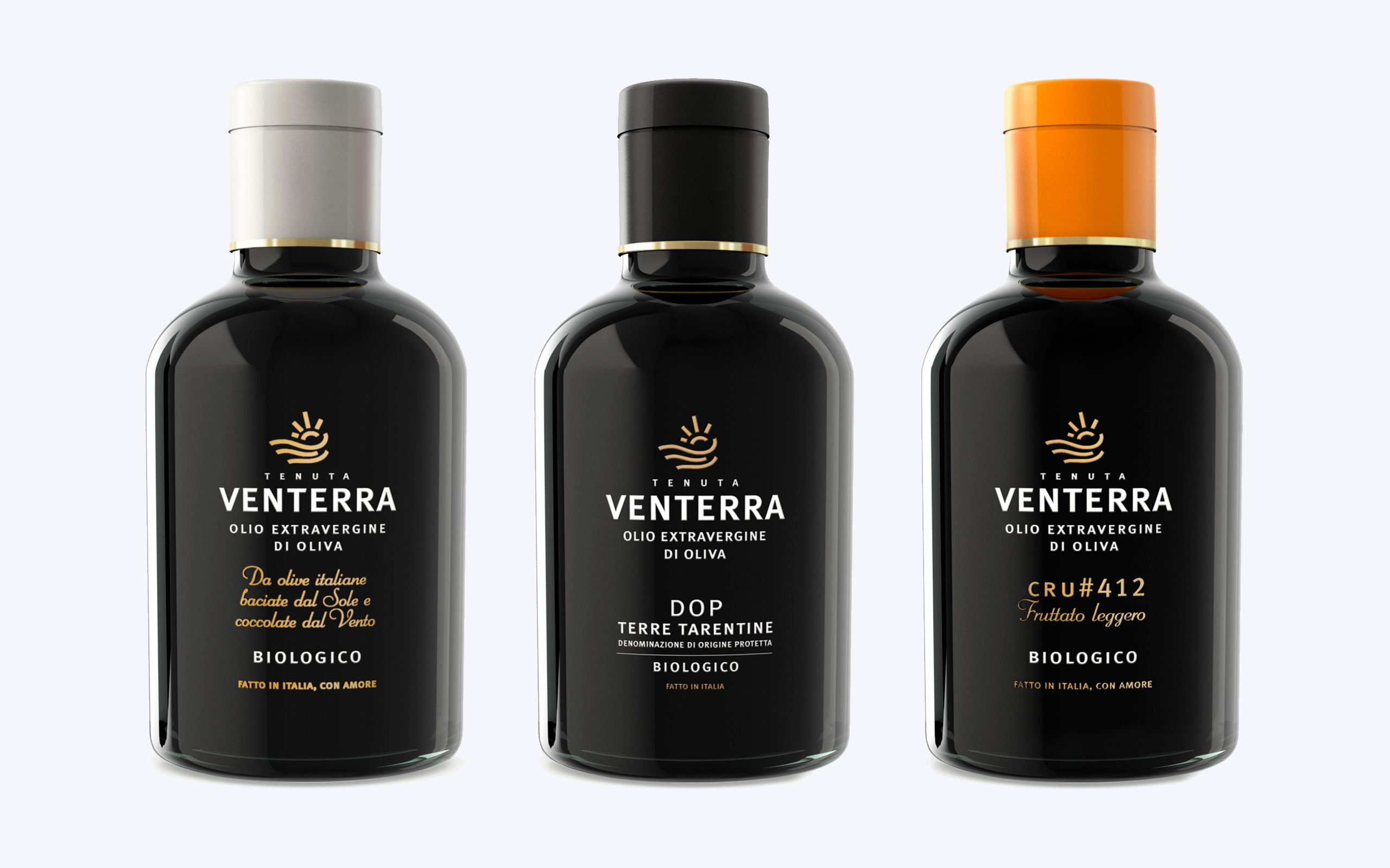
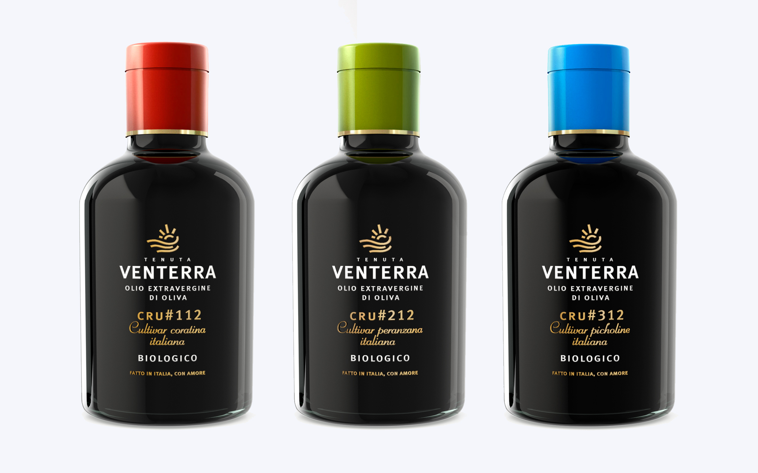
Packaging design
Awards
2016 | Bellavita London Awards, Tenuta Venterra, best packaging design and 3 stars Bellavita
2013 | Anuga Awards, Tenuta Venterra, Best Packaging for International Product
2013 | BioPack 18th edition, Tenuta Venterra, Second Place Ex Aequo Best Packaging
2012 | Brand Identity GrandPrix, Tenuta Venterra, 1st Prize Food Packaging Category
You might like
Planning a new project? Call us.