
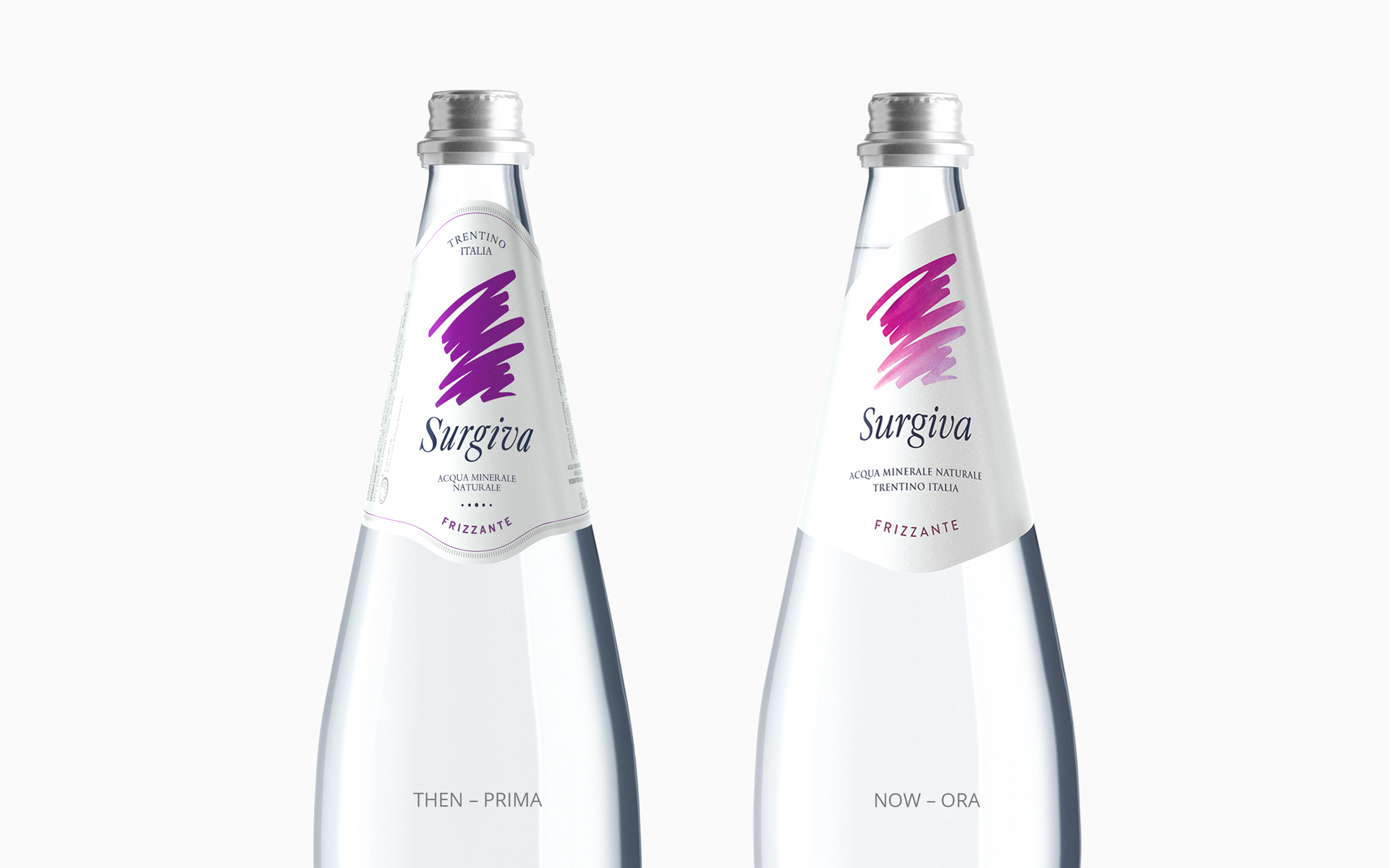
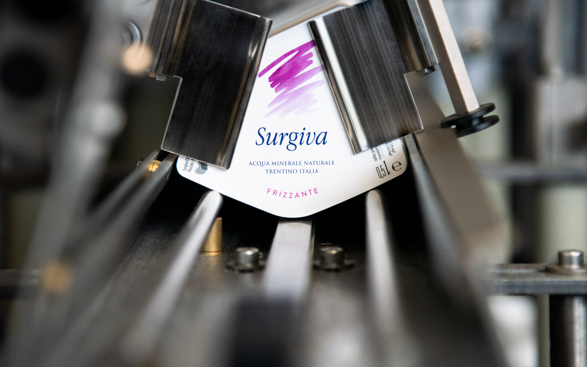
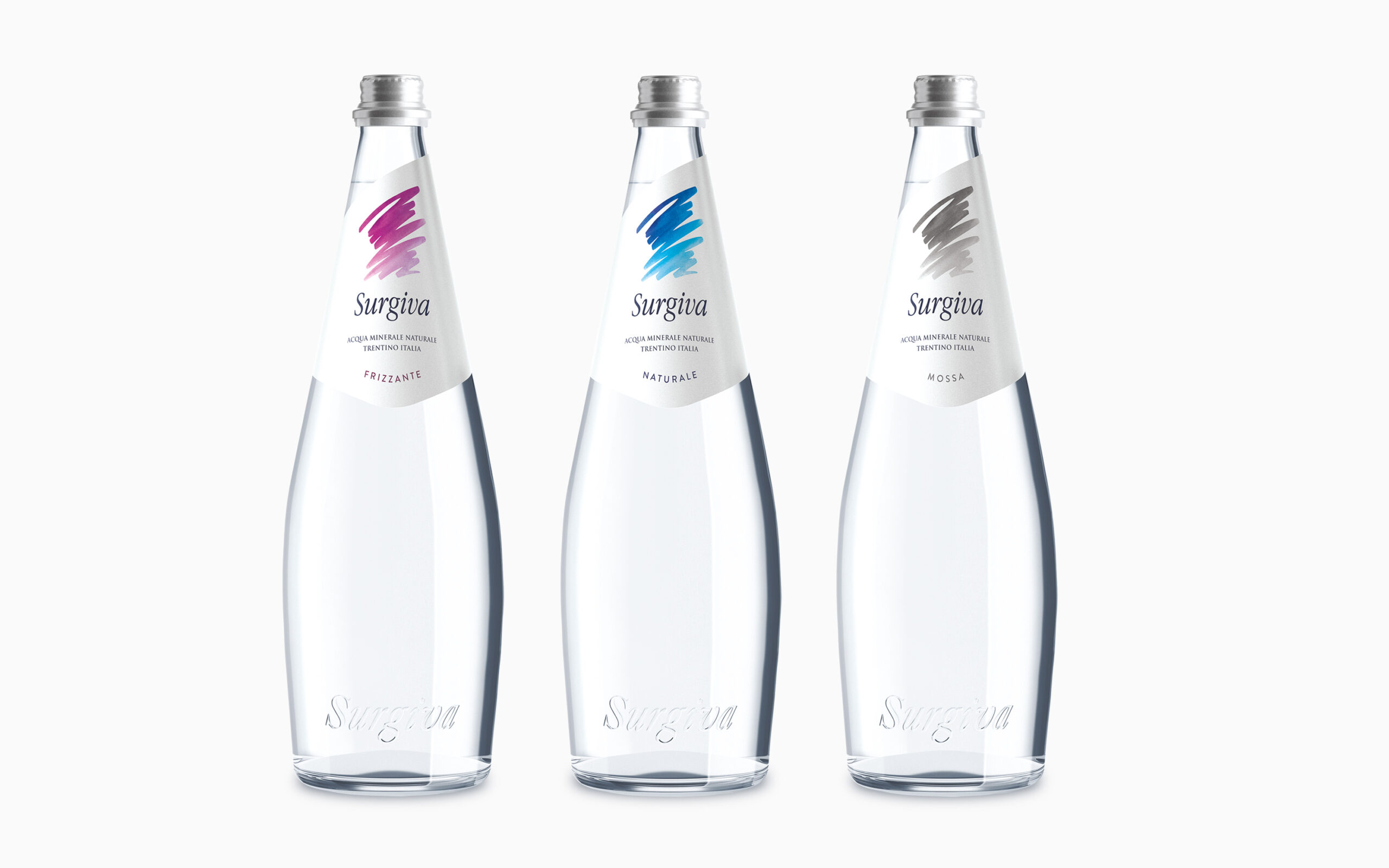
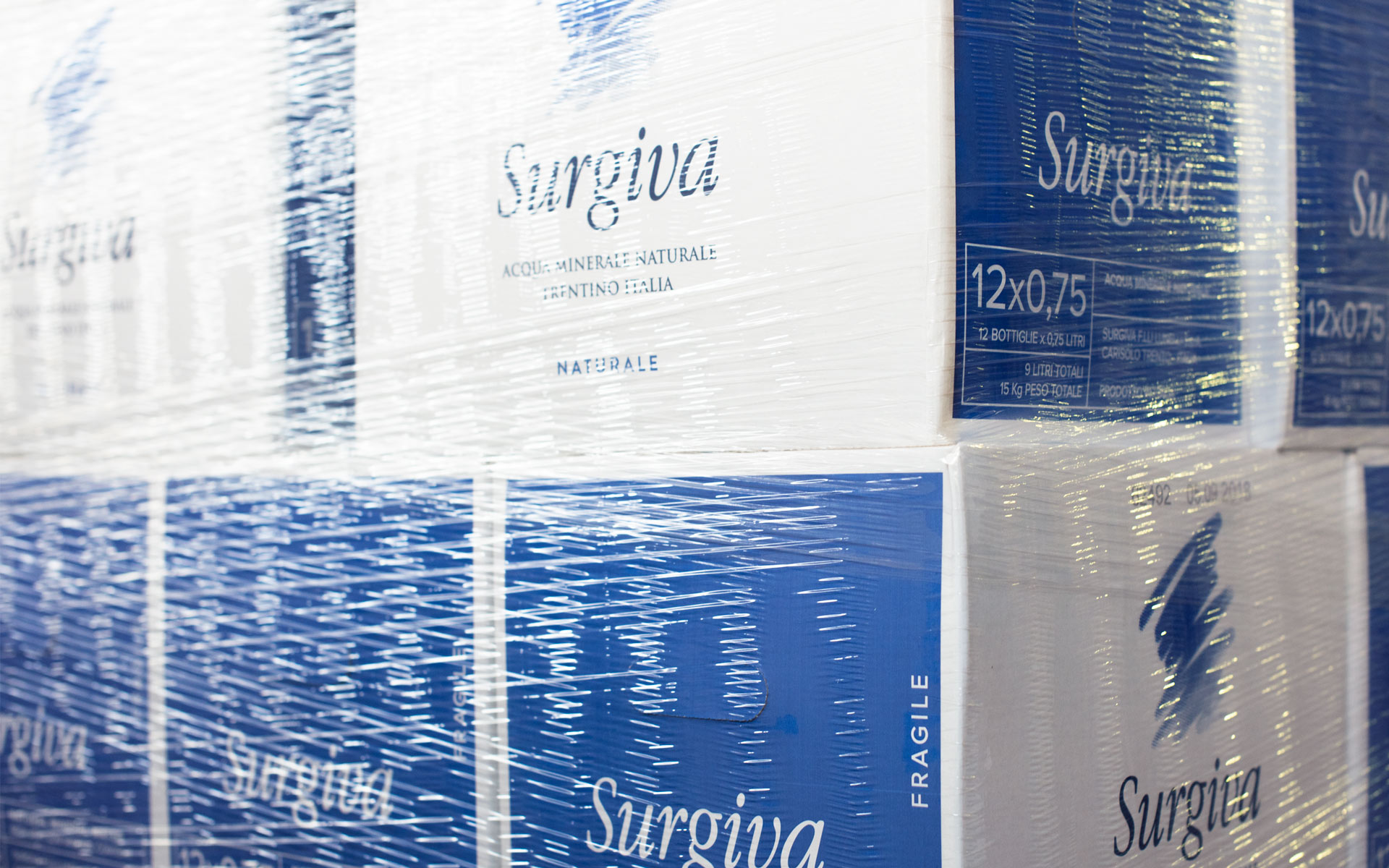
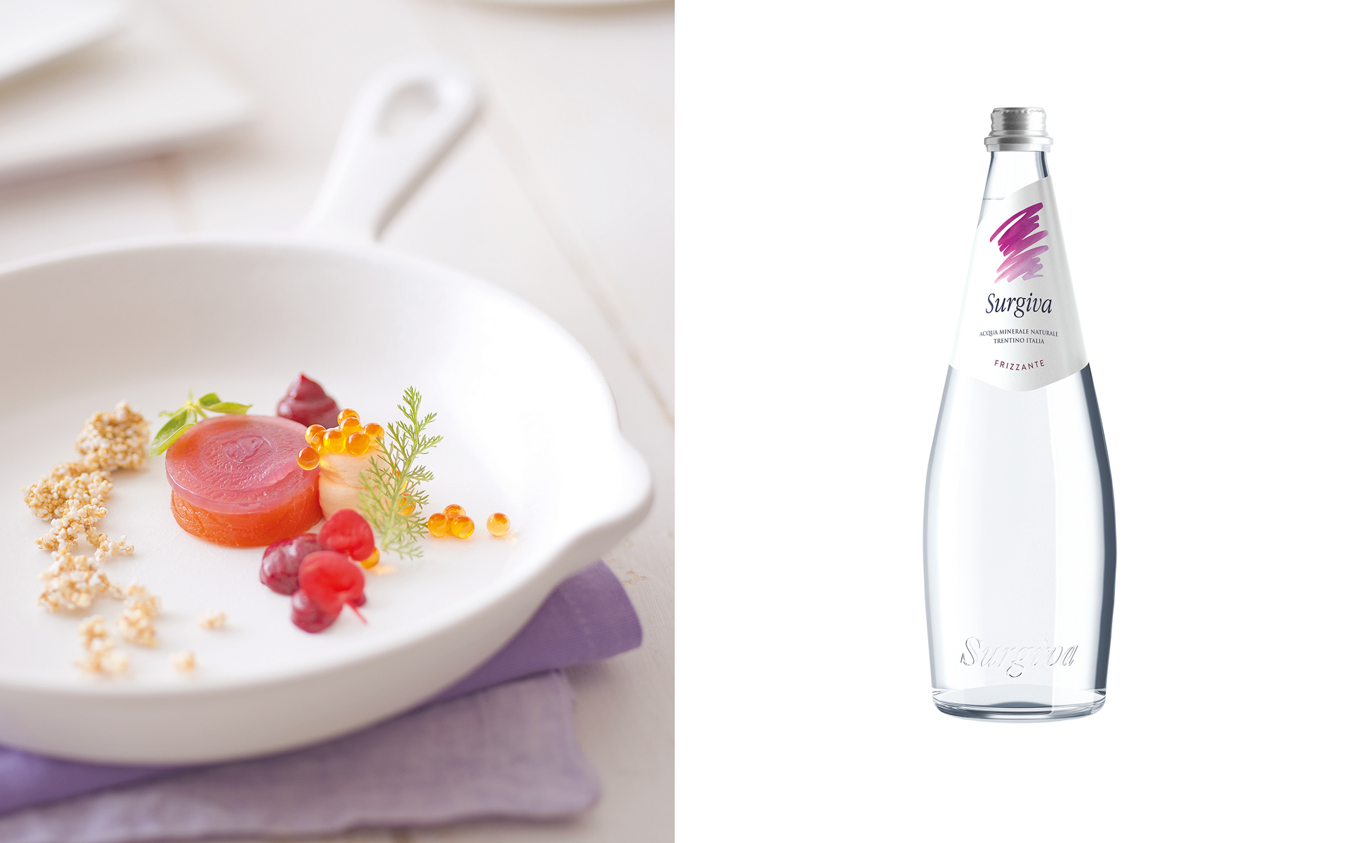
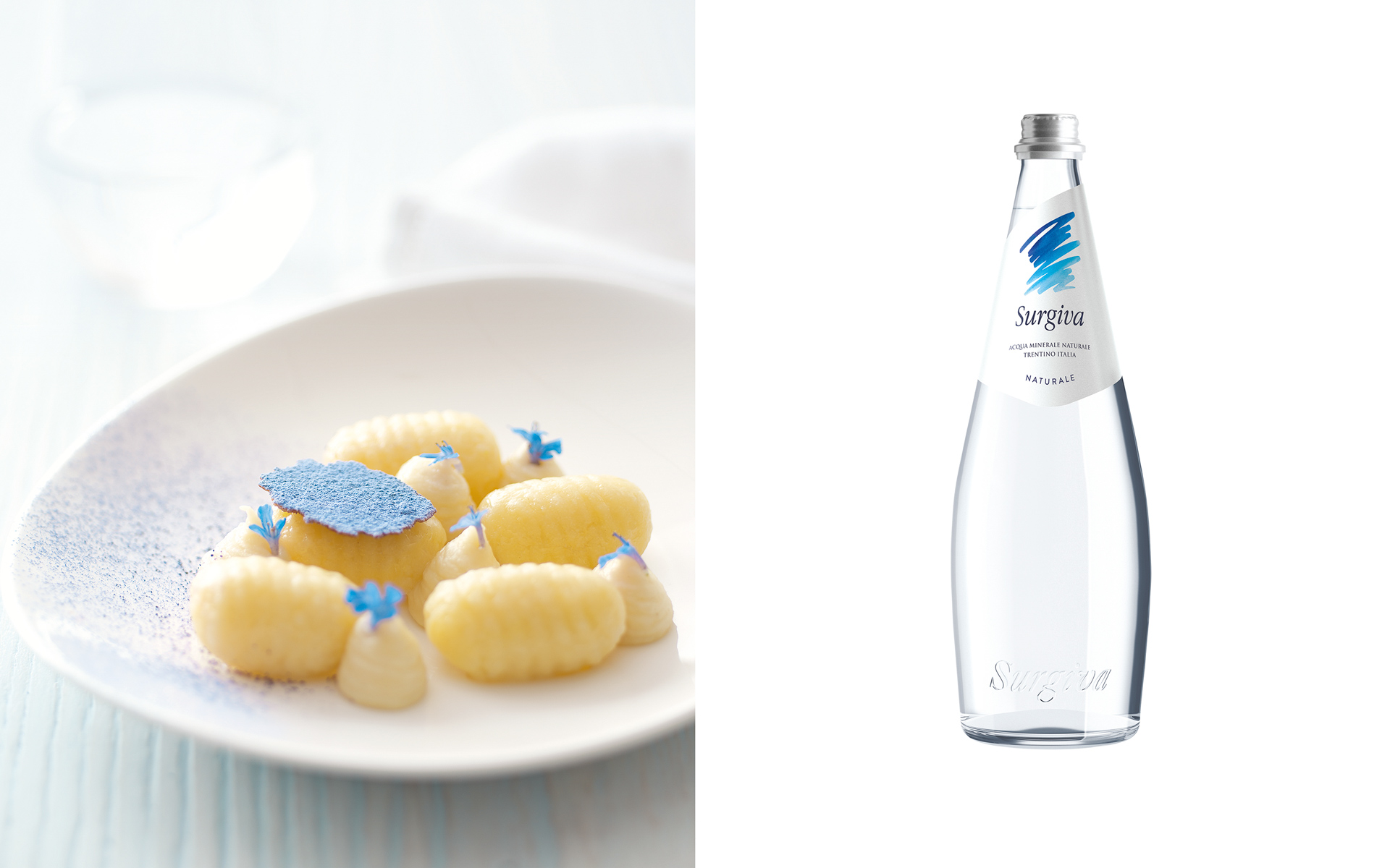
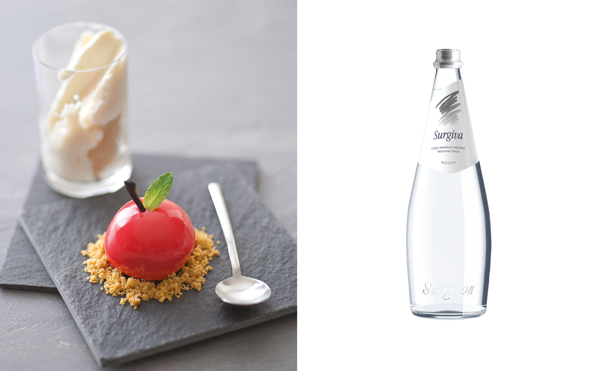
The restyling project for Surgiva arose from the need to renew its identity system. Our facelift involved three moves. The first was to maintain the stretch by reinforcing the water effect. The second was to revise the logo for a more harmonious design. The third was to switch from the Baroque-inspired label to a new one, characterised by a clean, oblique cut at the top, a move that reveals its stylish extravagance when the label adheres to the neck of the bottle.
What we did for this brand
Label redesign
Brand identity redesign
Identity brand book
Institutional brochures
Advertising
Outdoor big size posters
Signage
You might like
Planning a new project? Call us.