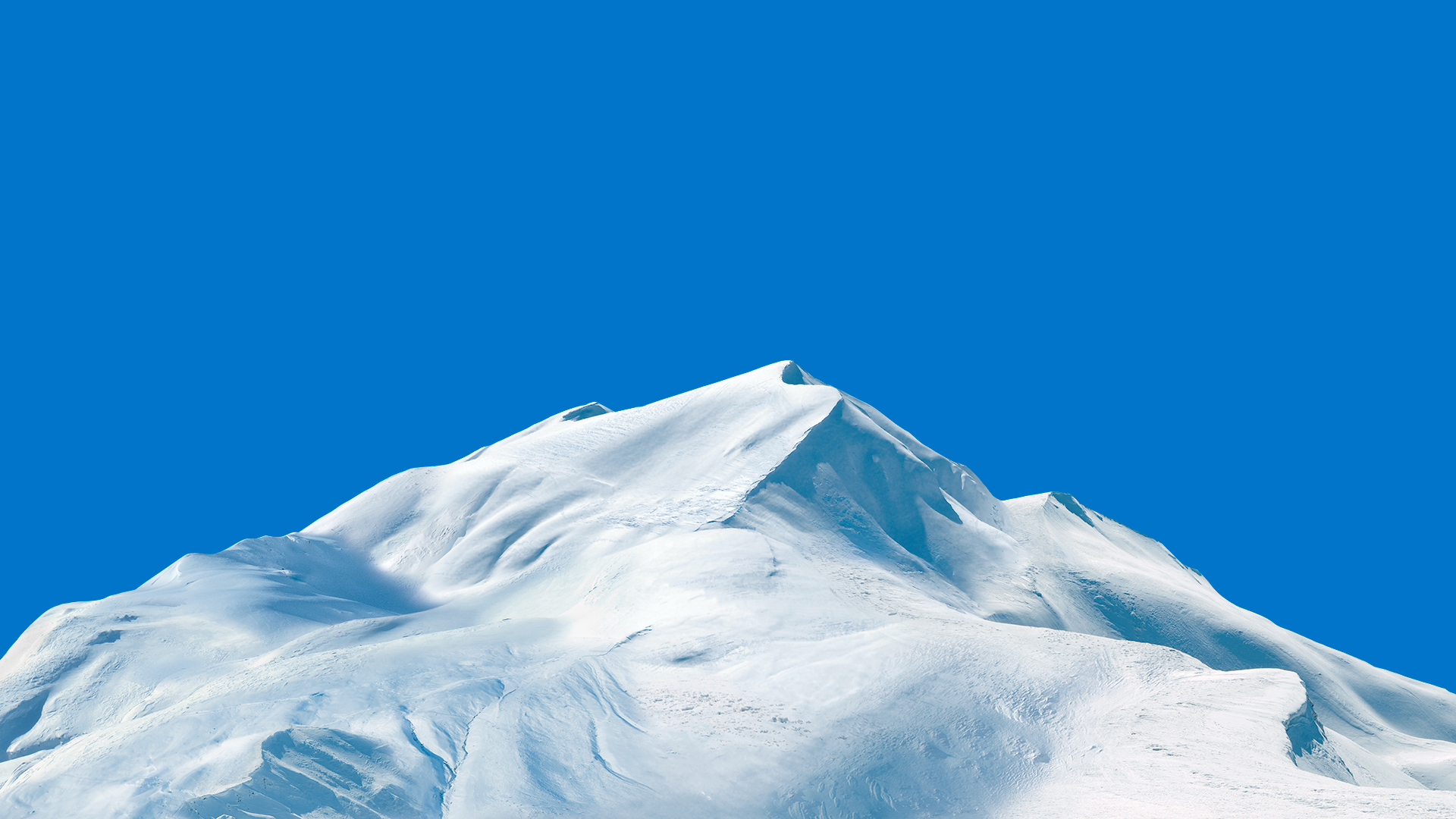
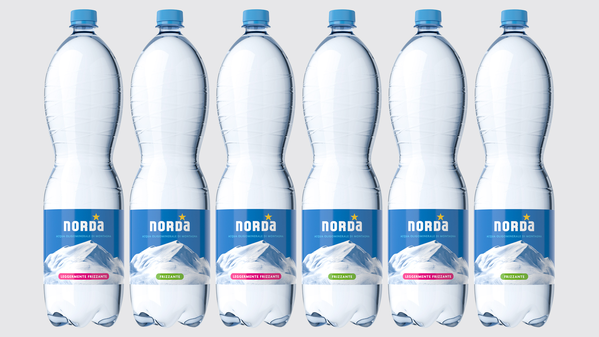
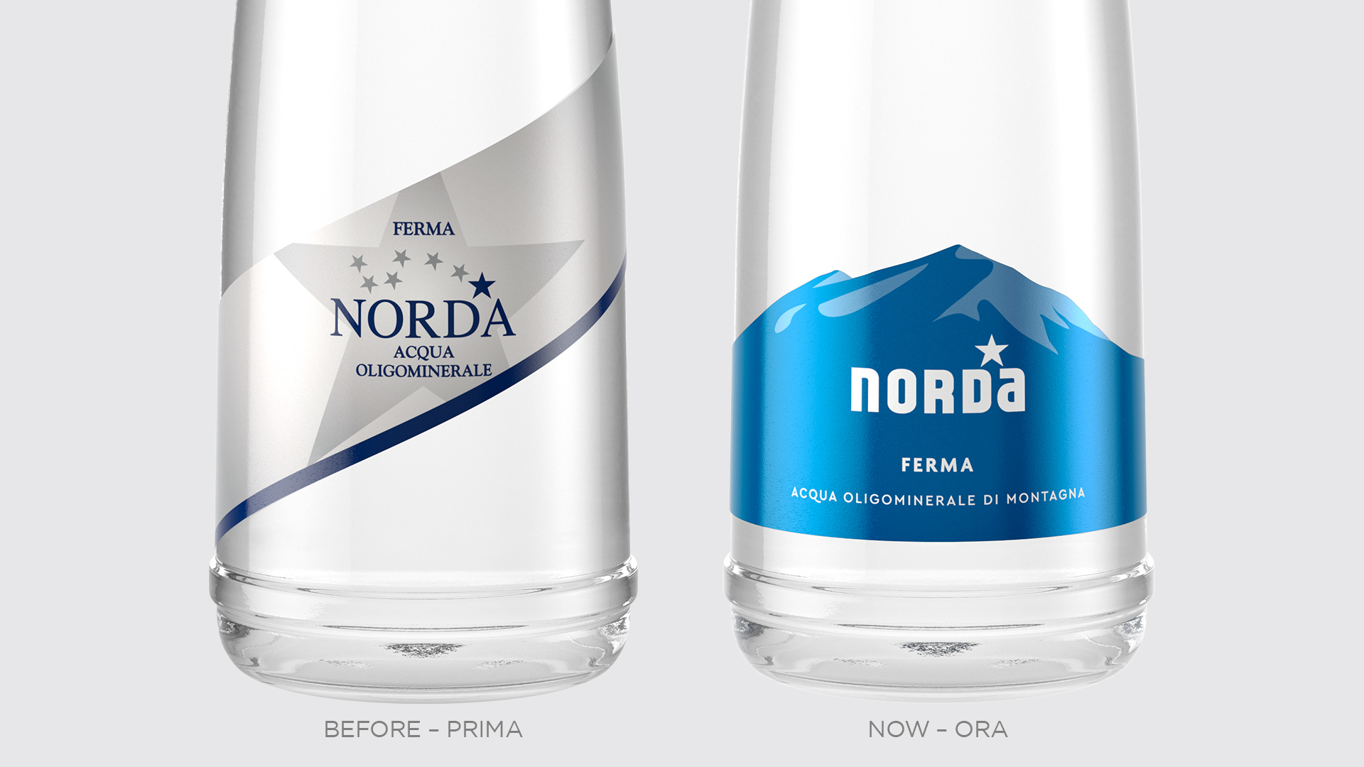
But is there a greater purity than a snow-capped mountain and a blue sky can inspire? Looking at the image above, doesn’t it feel like cold air to breathe? When a brand tells its idea of purity in this way, it is best left untouched. It was with this in mind that we revised Norda’s identity system. Another case where an essential design was more necessary than ever.
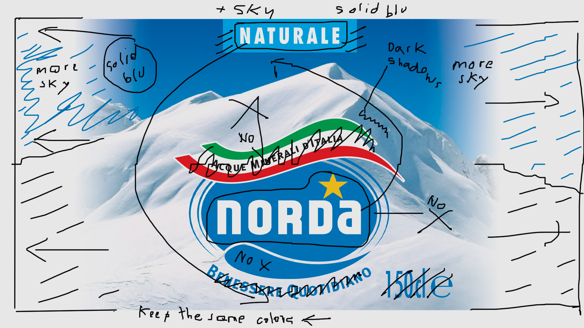
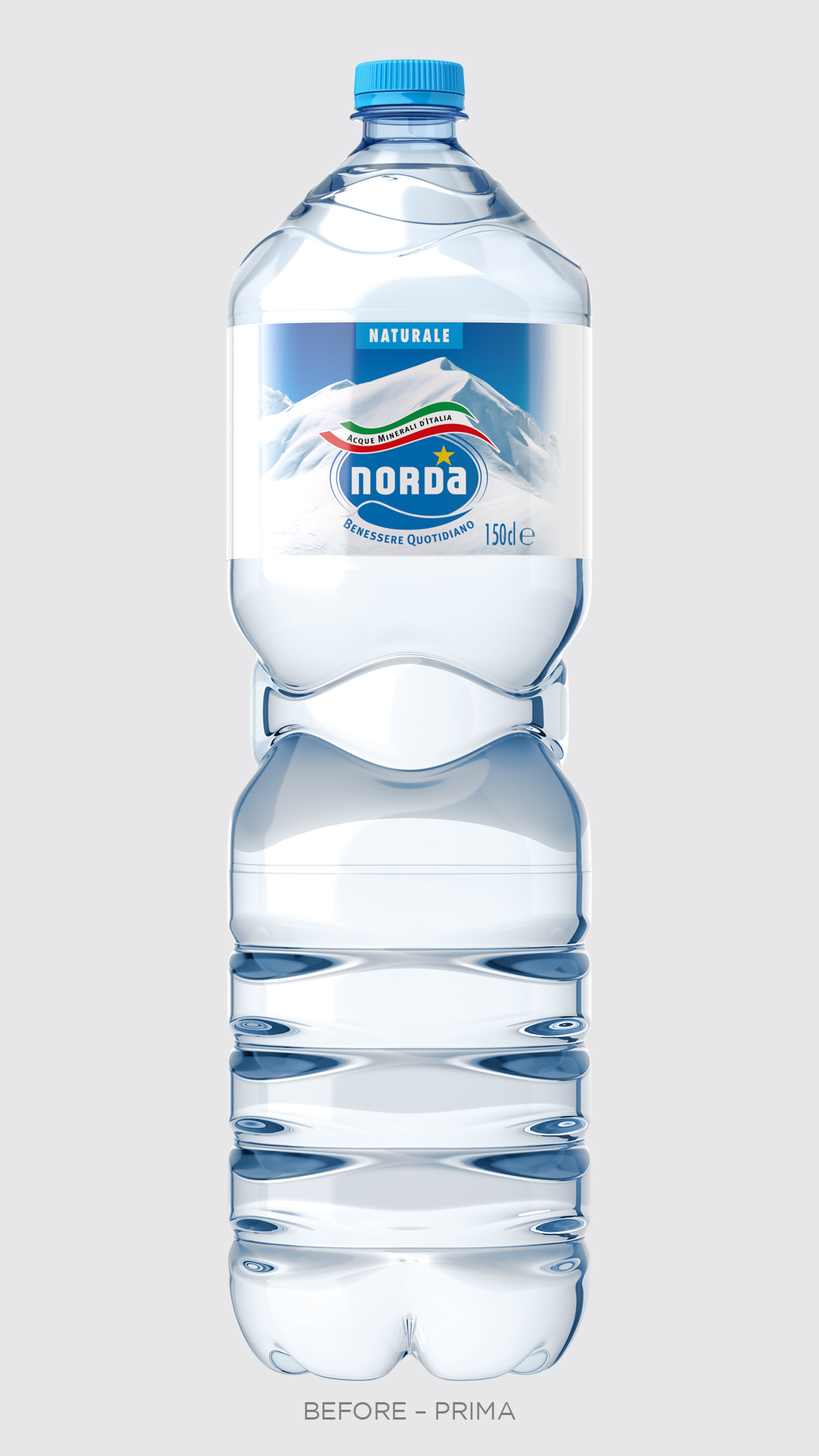
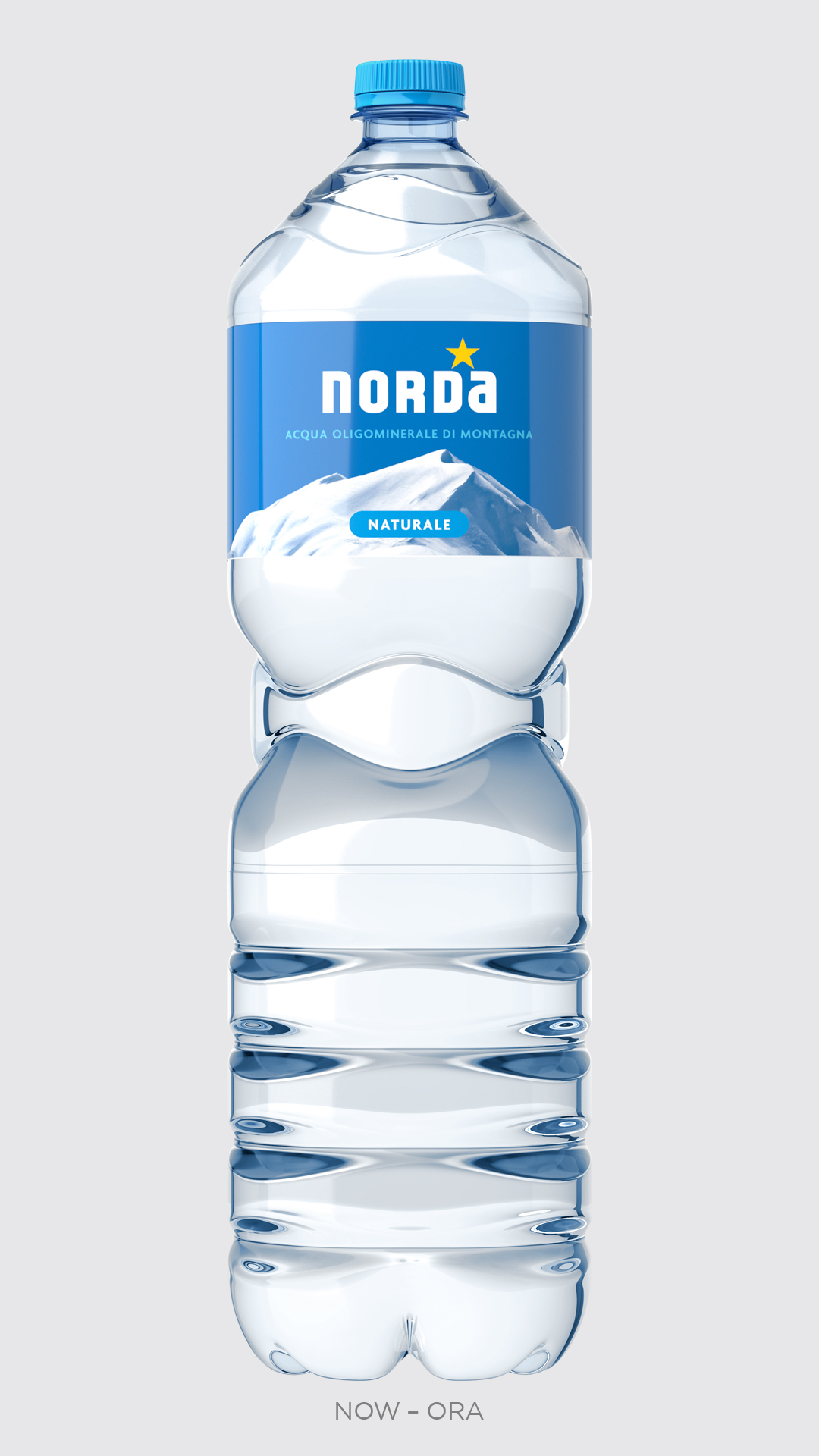
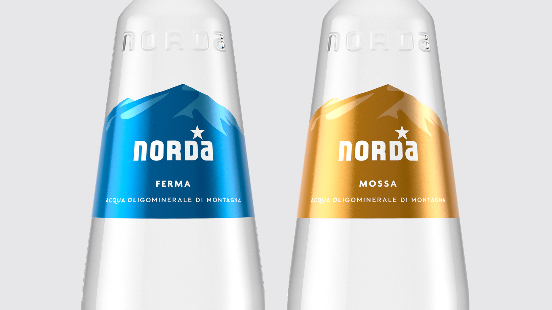
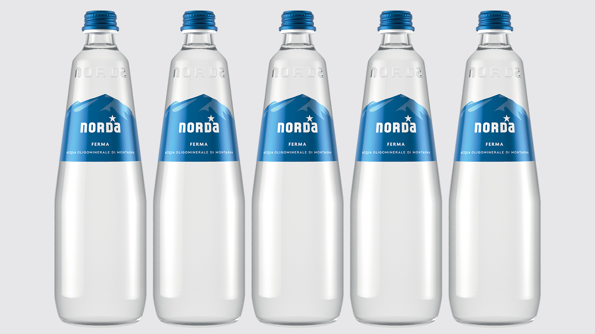
Our revision project pursued the idea of purity by adopting simple lines. Compared to the previous design, each visual element has found its natural place, carefully avoiding graphic juxtapositions. The sky has increased in width, the logotype has found ease in the blue background, unnecessary elements have been removed. A few simple but decisive moves to describe a place.
What we did for this brand
Visual identity redesign
Label redesign
You might like