Redesigning a visual identity or redesigning a package is like making it the same but different. The distance between departure and arrival should not be so great, and there is a reason for this: if the gap is minimal, perceptual continuity between before and after is assured. But this is not always the case. Each case is different and the degrees of difficulty are different. One thing is certain: if the redesign is very strong, the rip-off from the starting version is certain. Many brands fear this kind of revolution, but many others seek it.
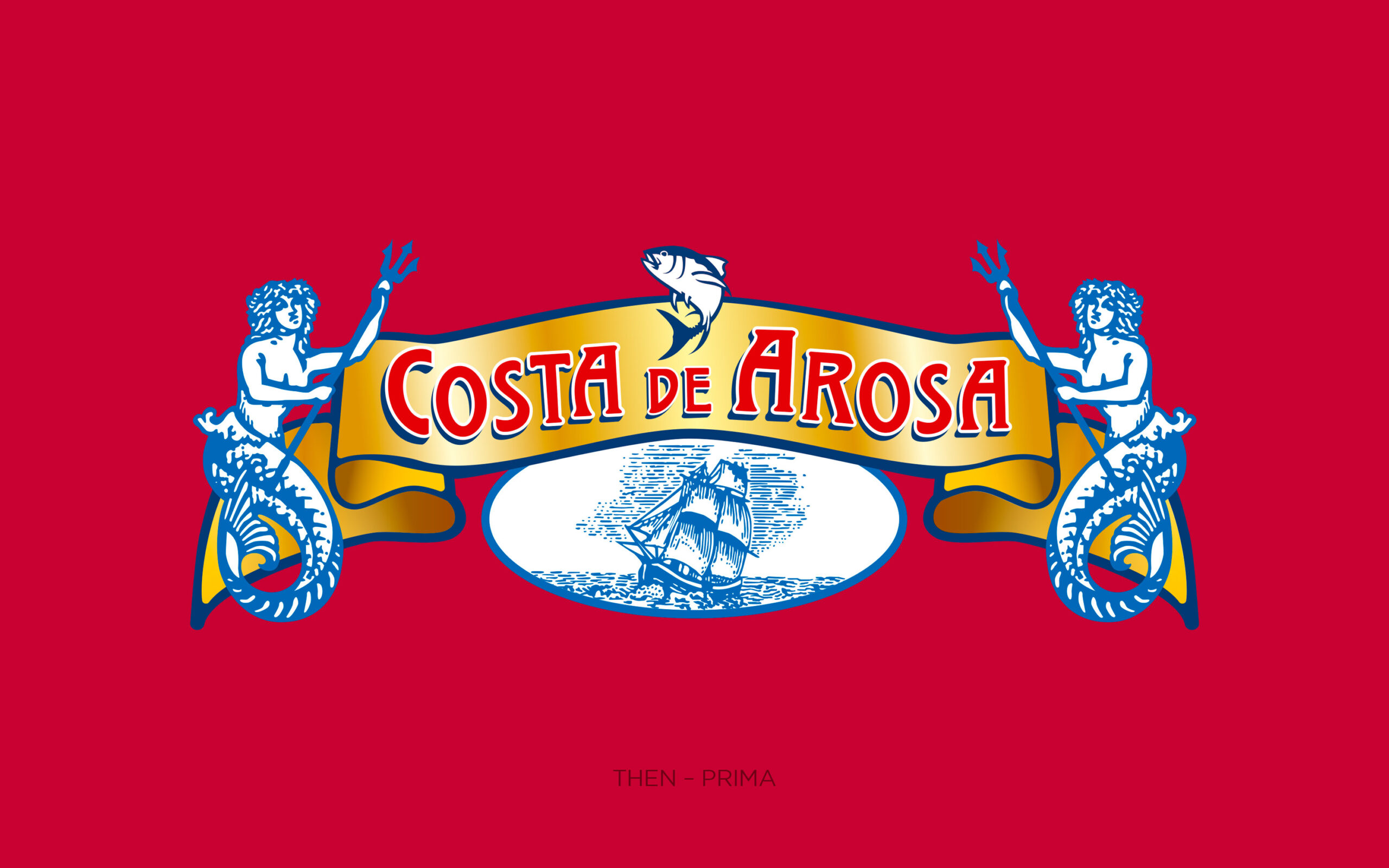
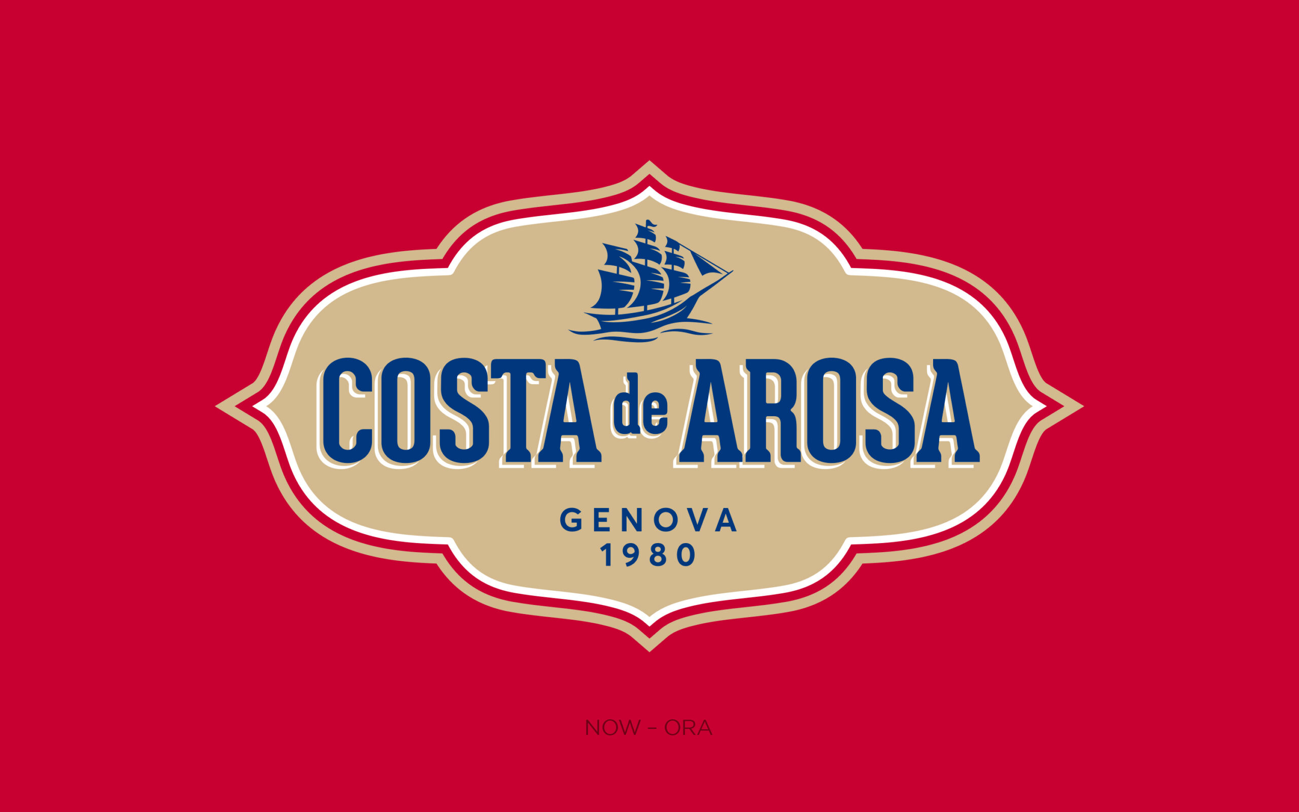
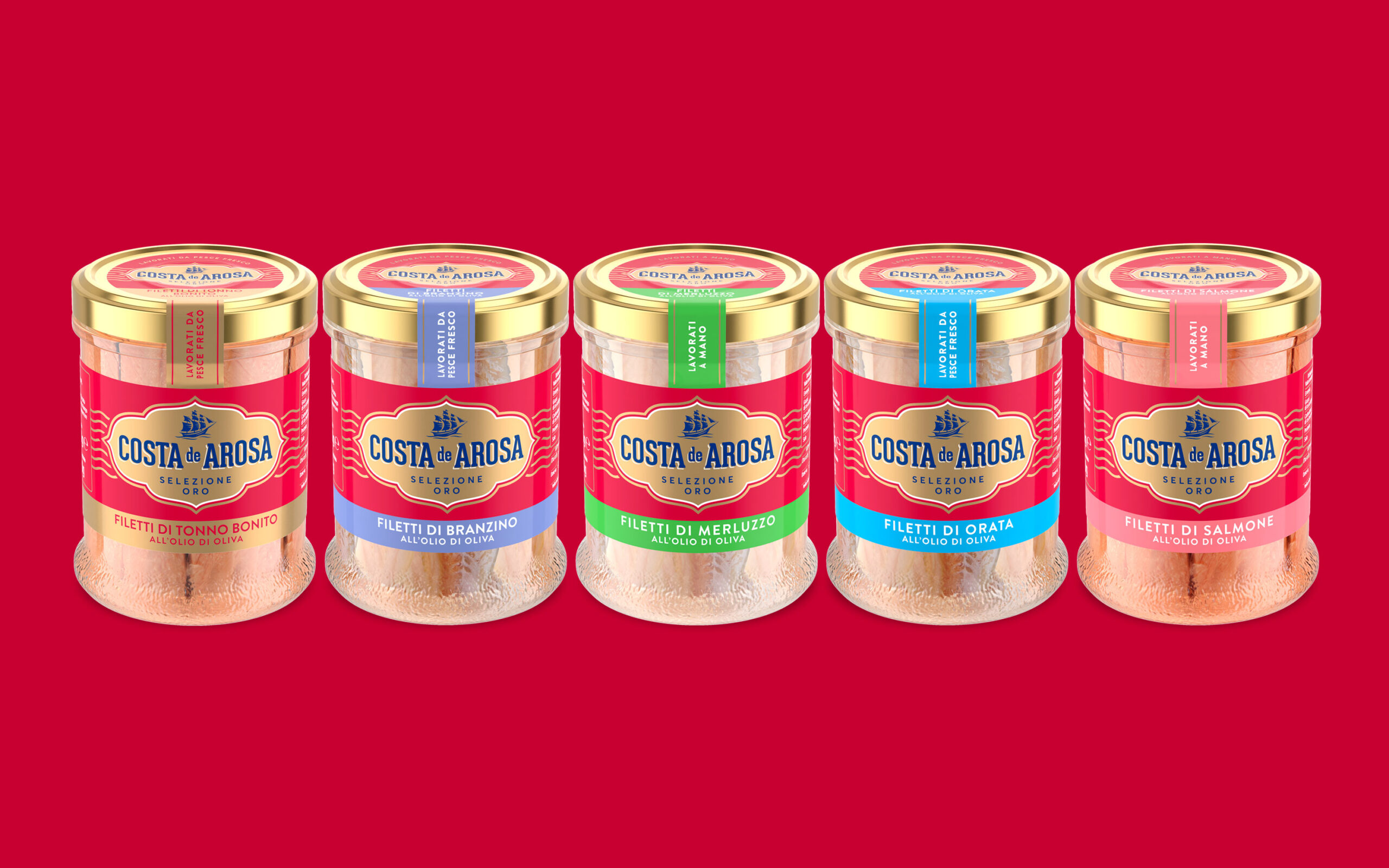
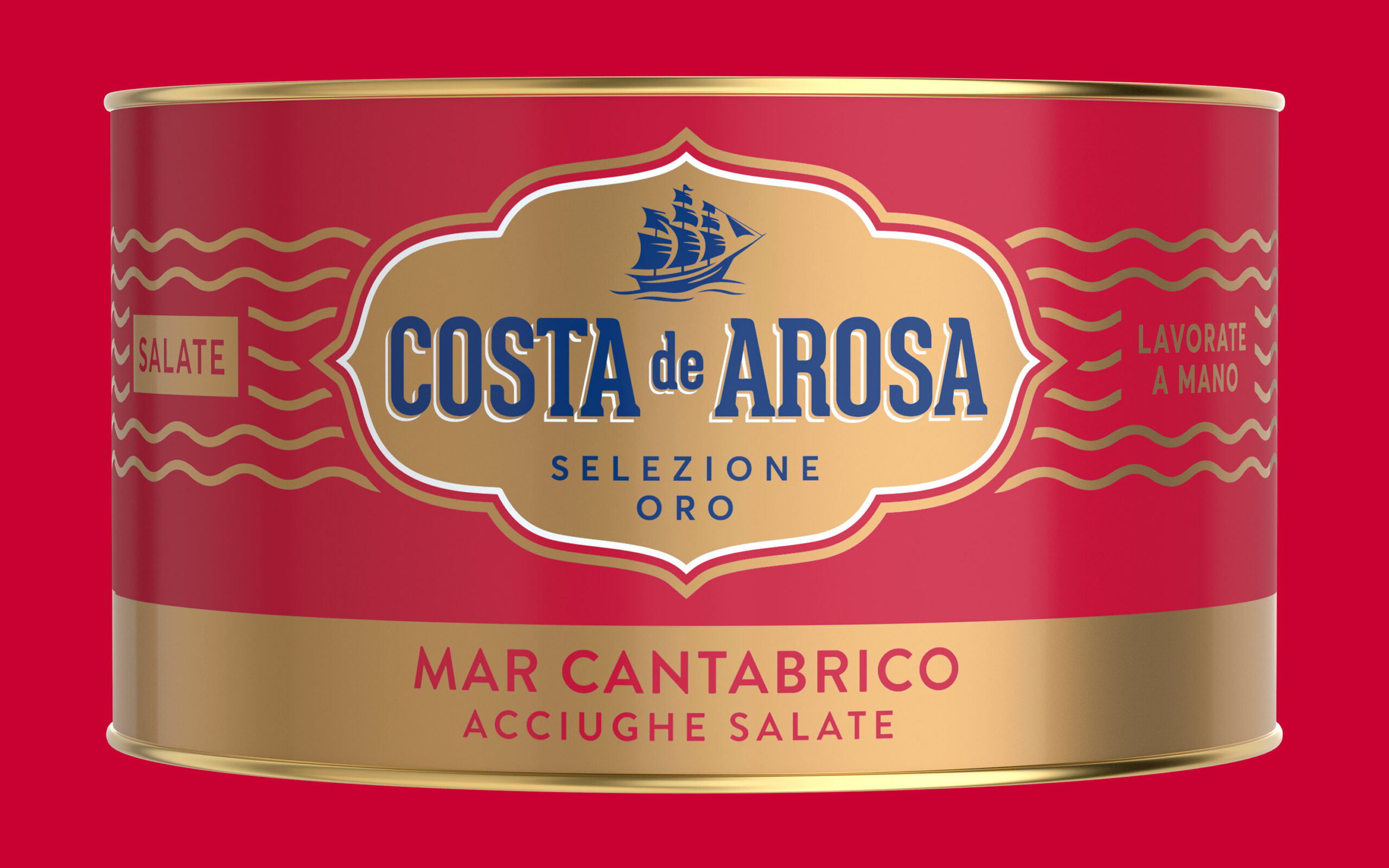
This is the case of Costa de Arosa, an example of a revision that is anything but conservative. We simplified the signs of the previous visual identity, introduced new formal elements and rebalanced the colour system. Above all, Costa de Arosa now has a regenerated and organised visual identity.


What we did for this brand
Brand identity redesign
Packaging redesign
Planning a new project? Call us.