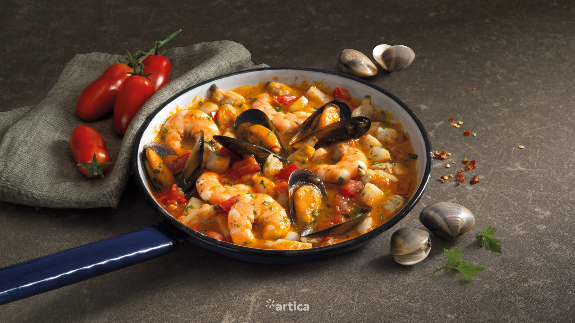
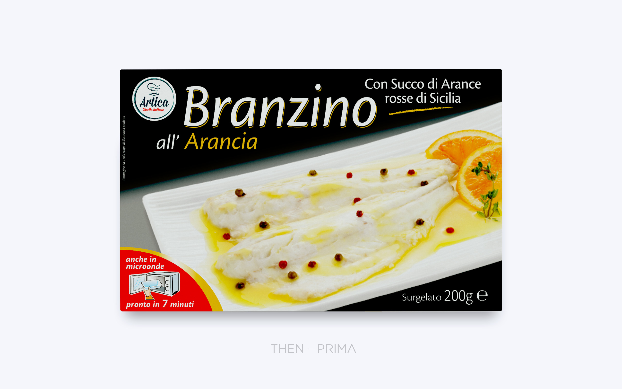
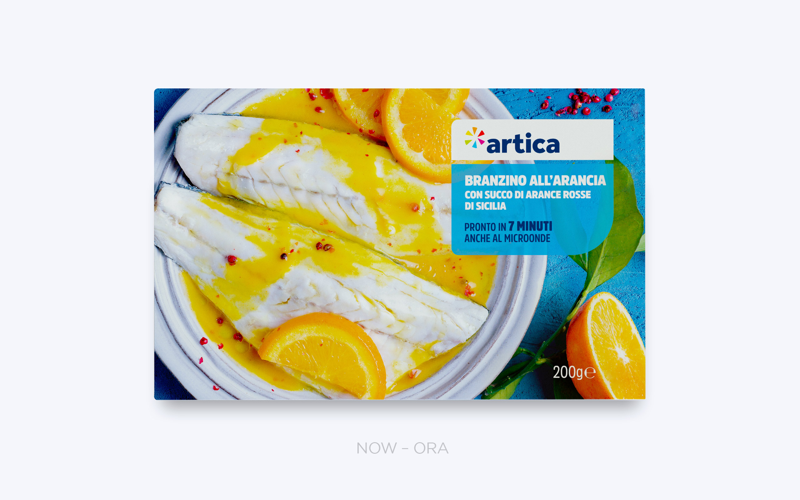
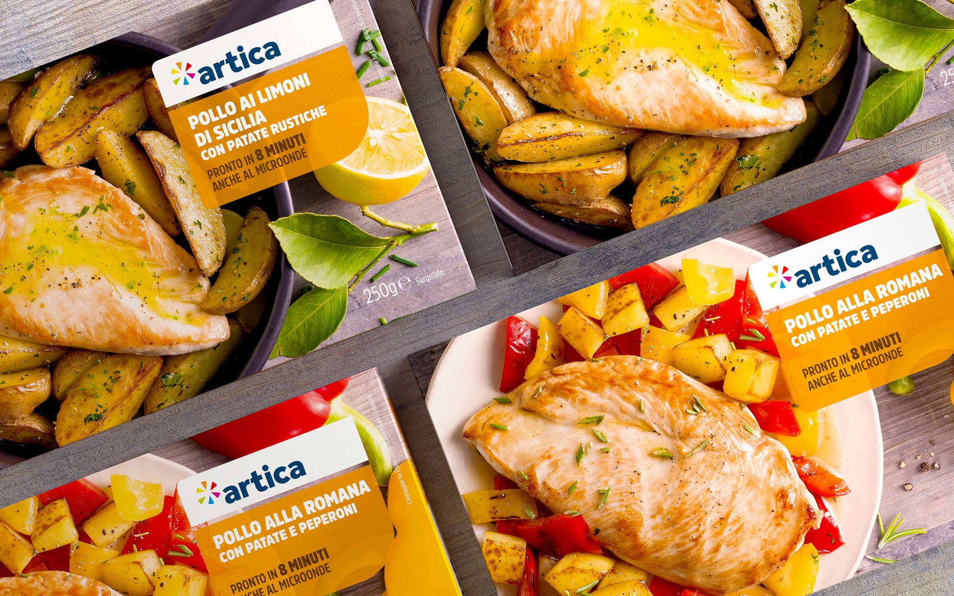
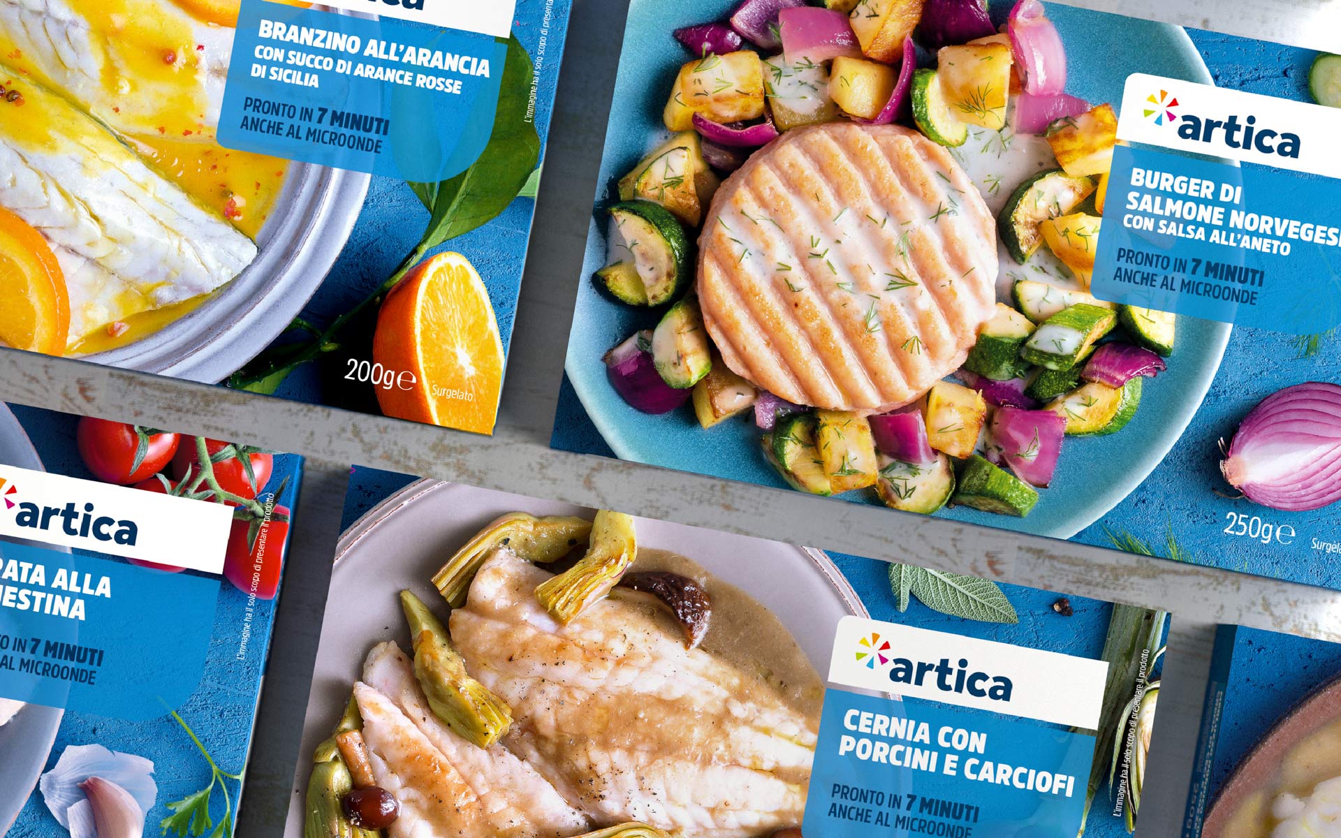
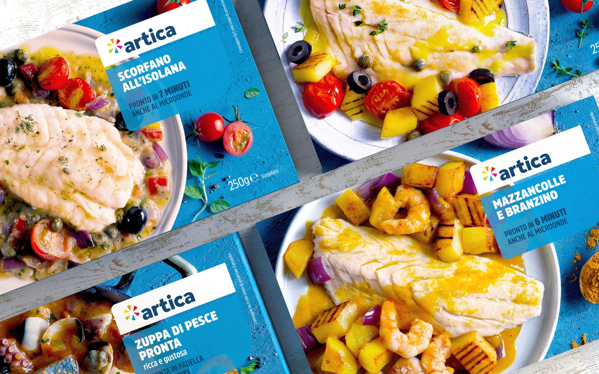
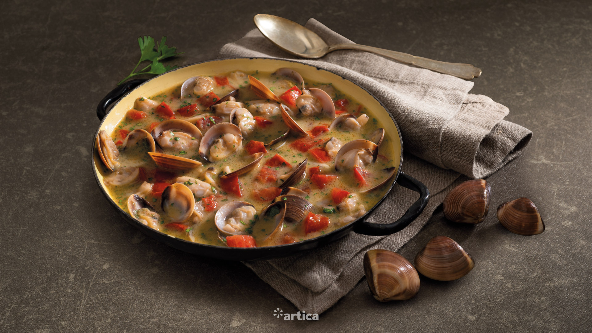
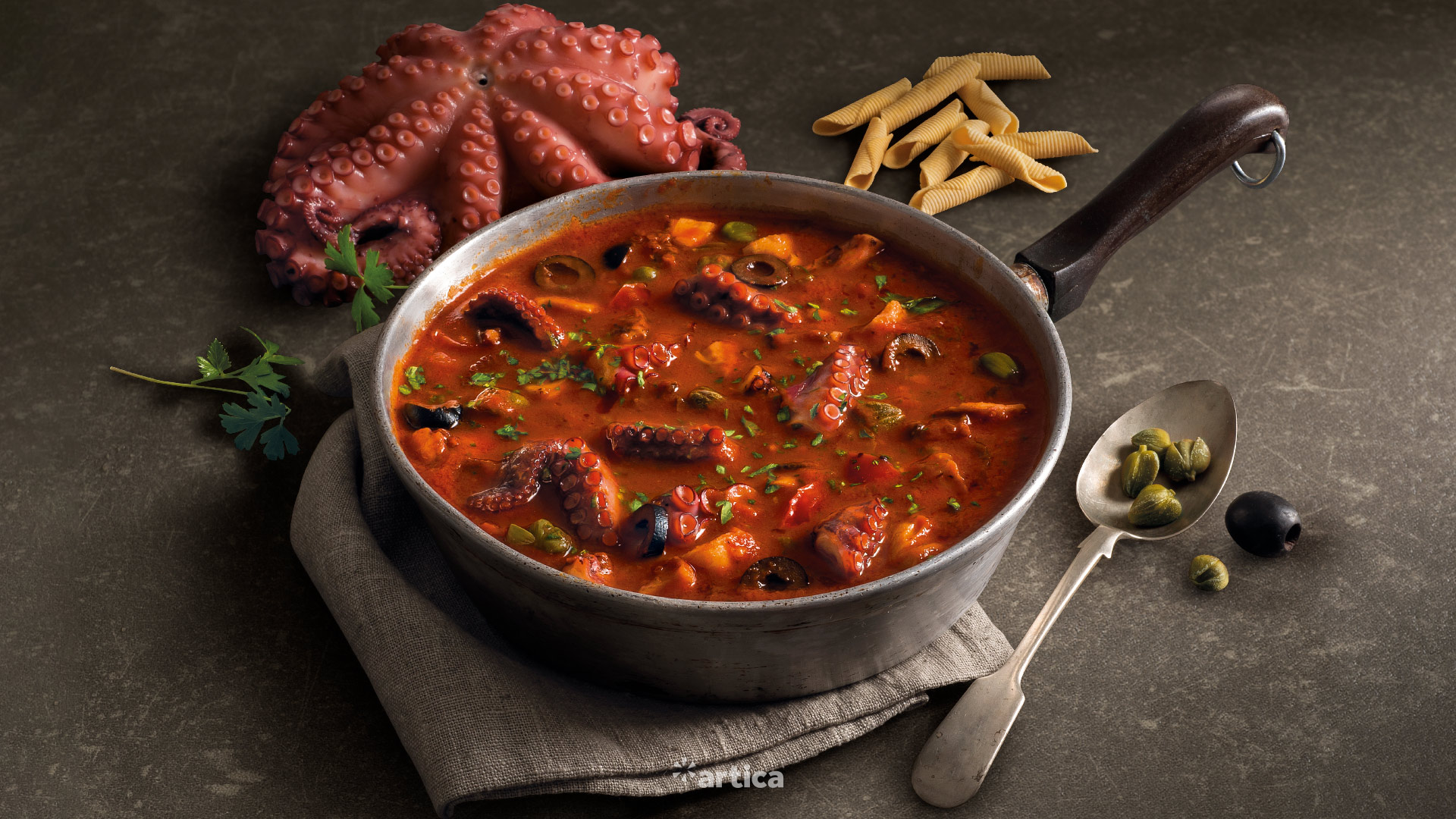
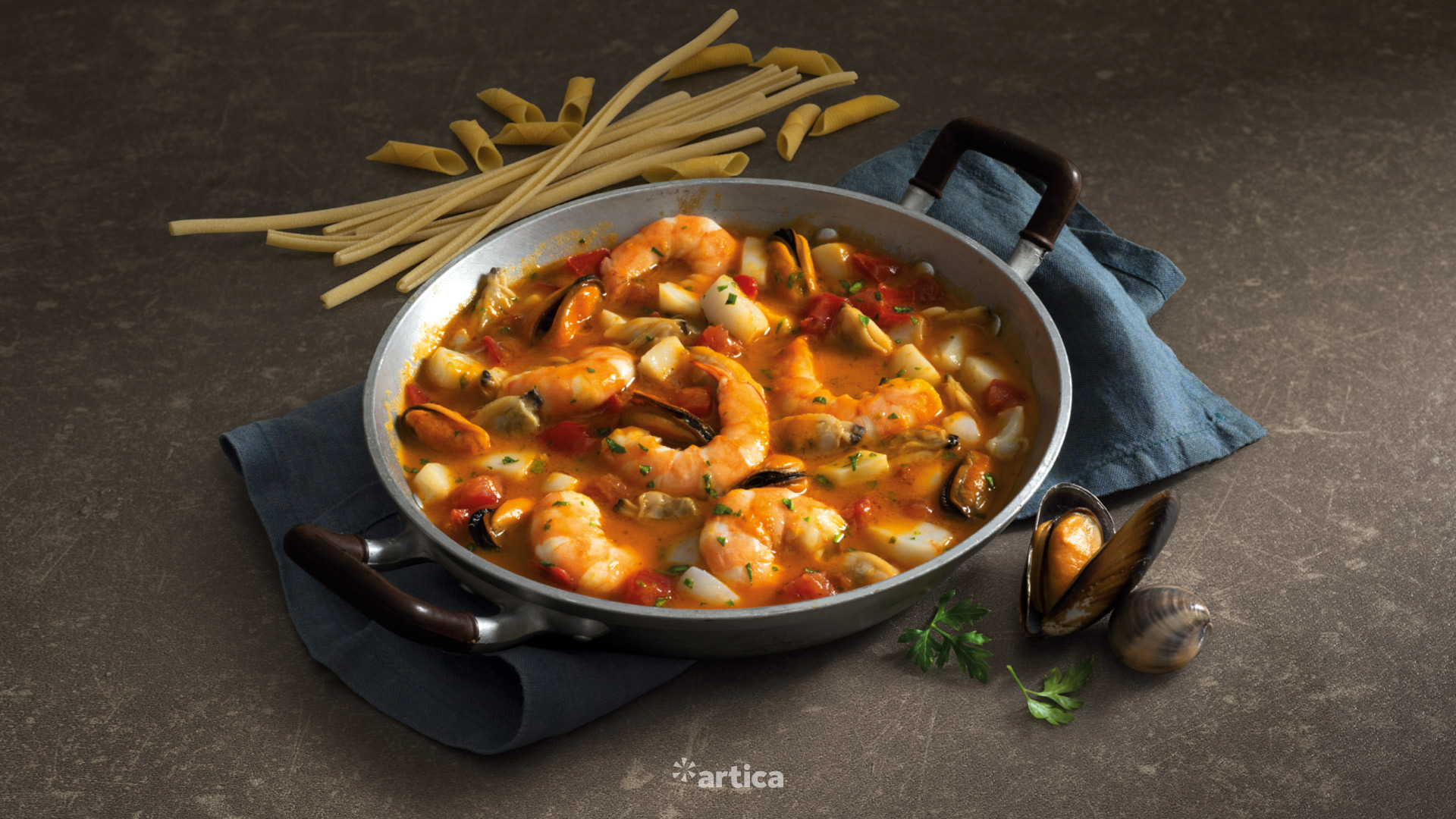
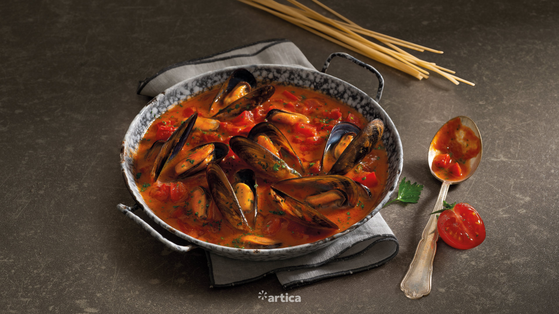
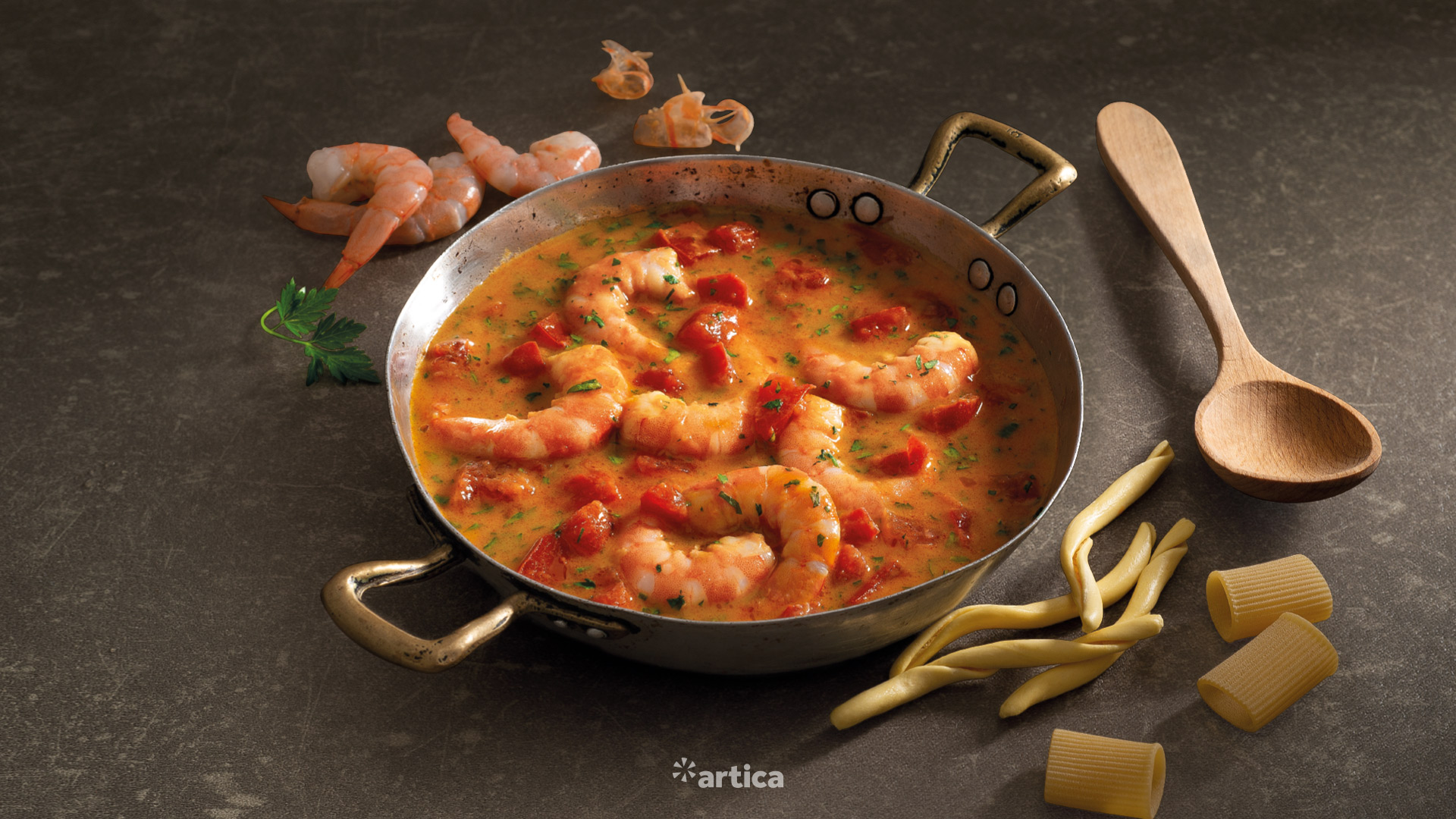
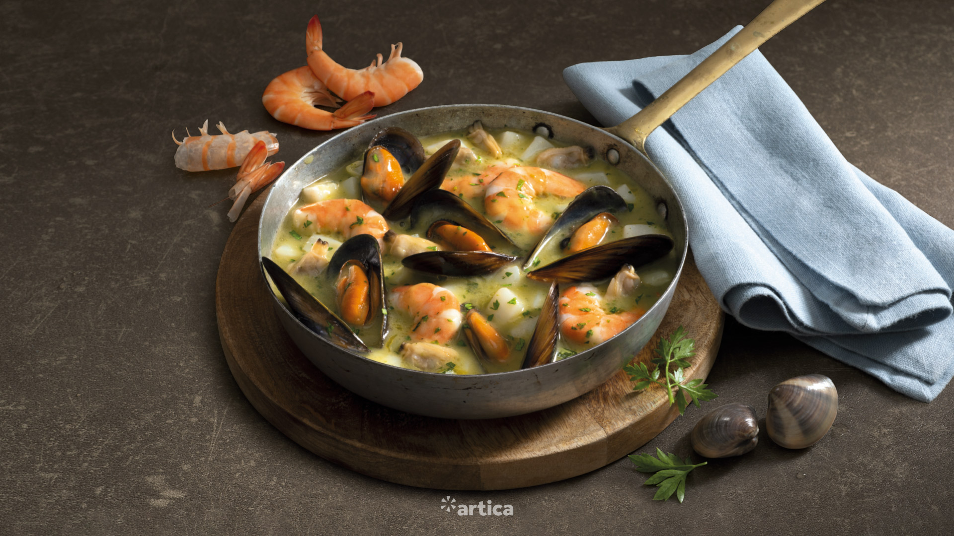
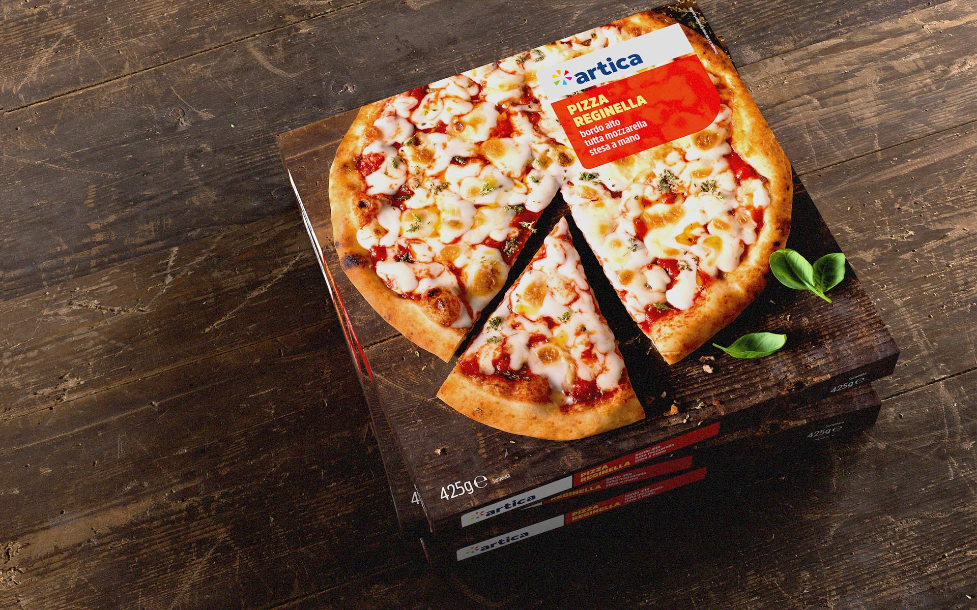
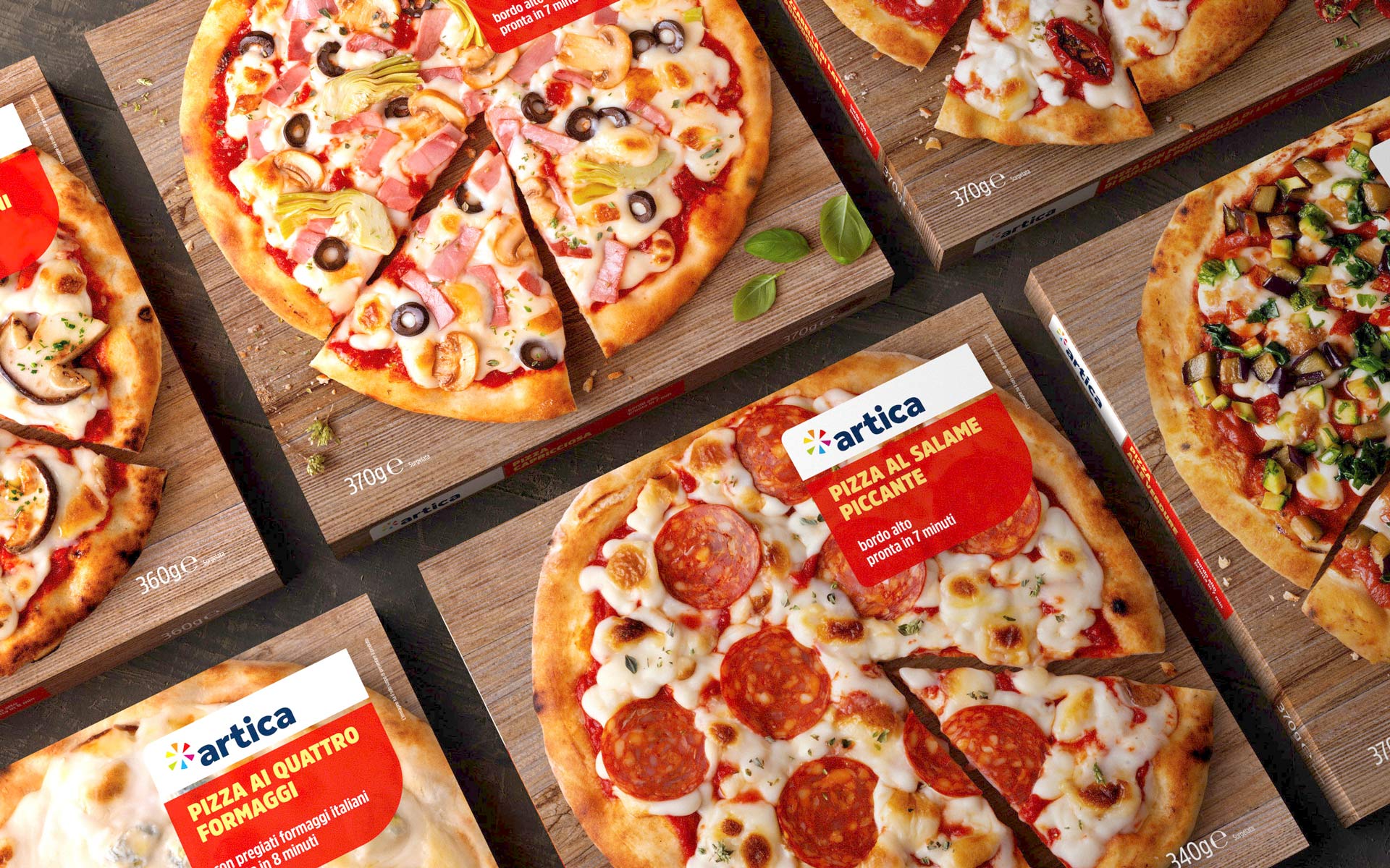
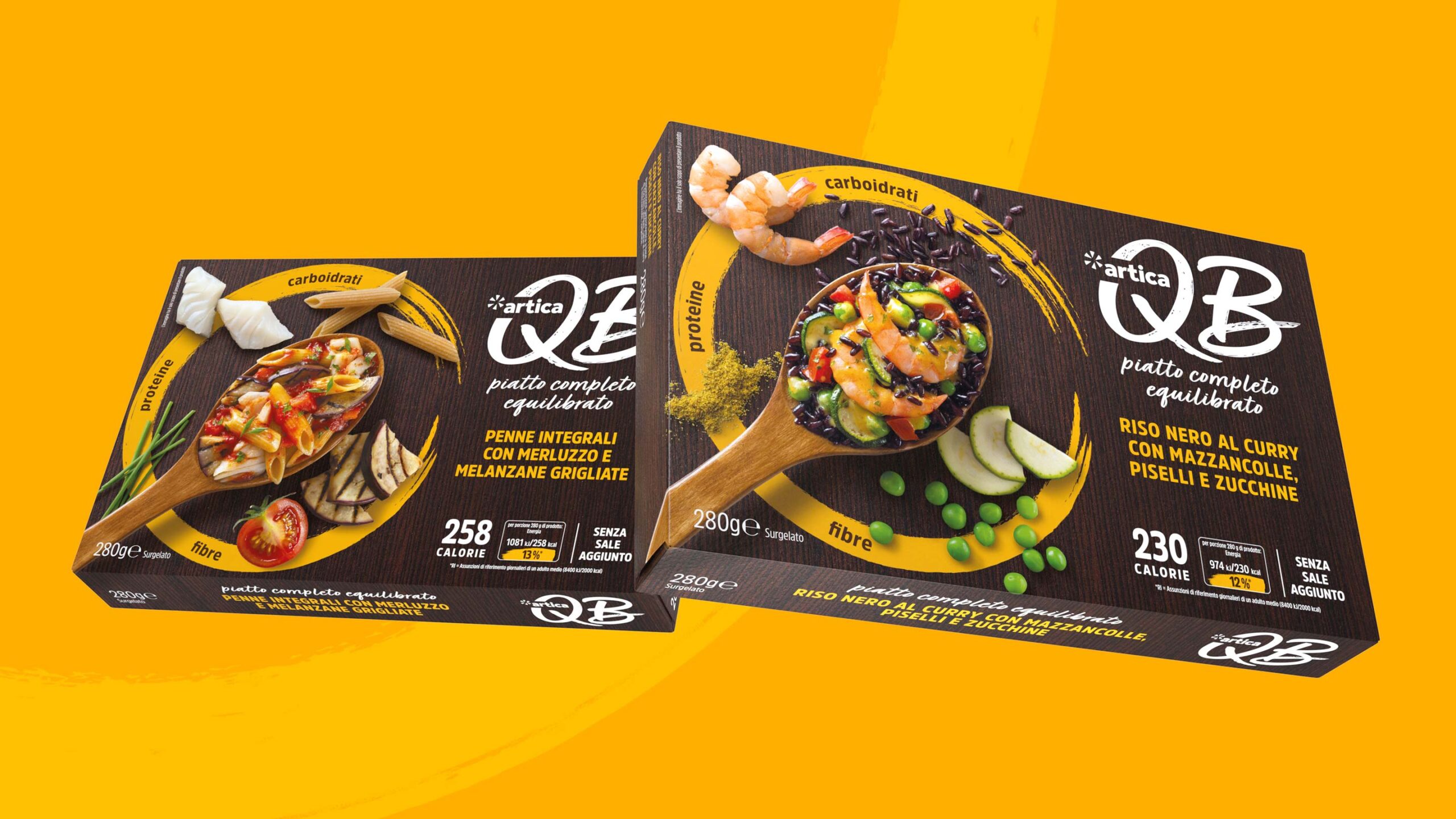
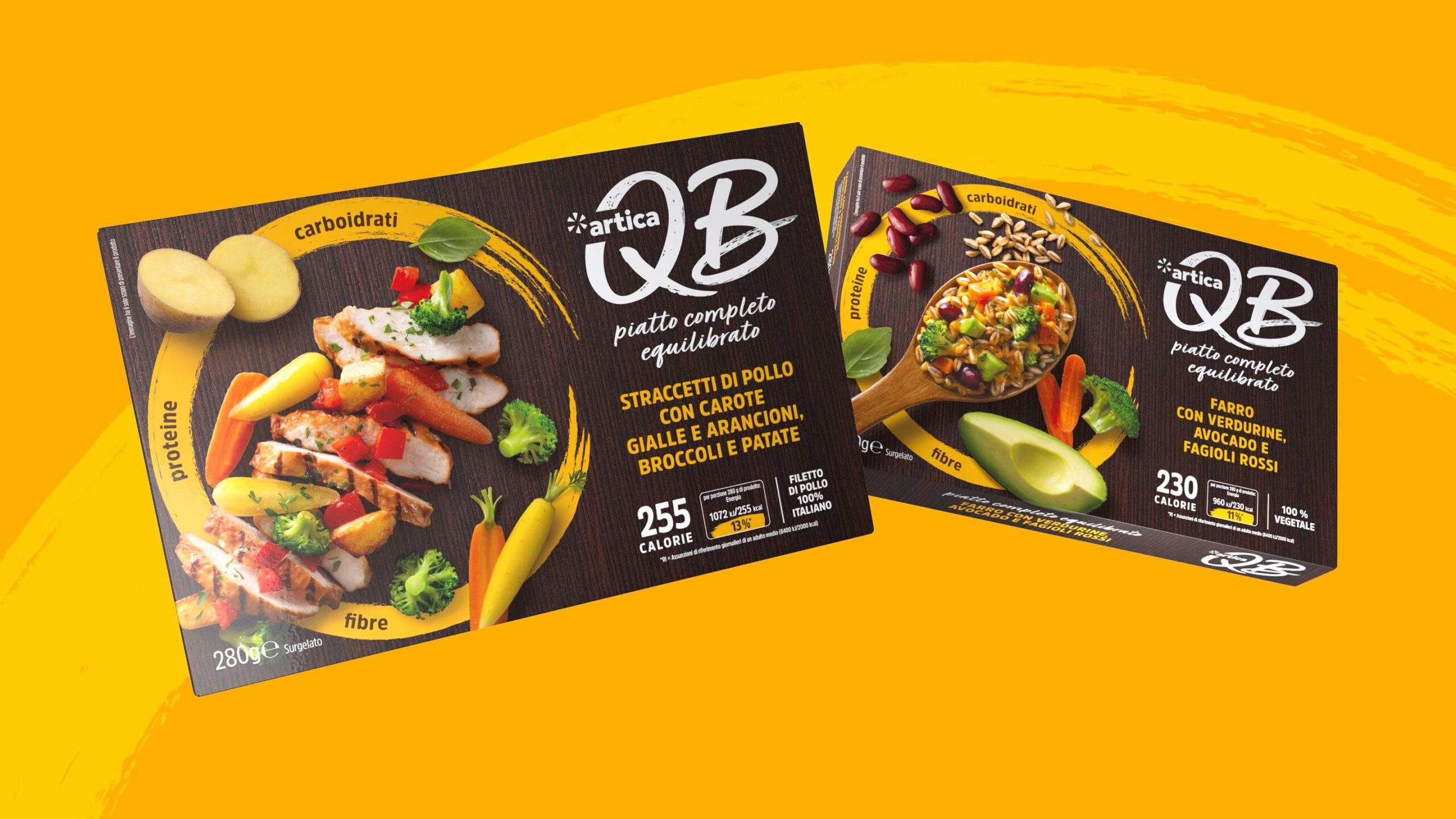
Artica is a brand that offers frozen ready meals. Our restyling project started with a revision of the logo and then arrived at a packaging design system significantly different from the previous one. It is an example of how the evocative function is crucial in the representation of products preserved below zero: all the focus is on the suggestion of a good dish to be eaten, even before it reaches the table with the eyes.
What we did for this brand
Artica
Visual identity restyling
Packaging restyling
New references design extension
QB
Naming
Visual identity design
Packaging design