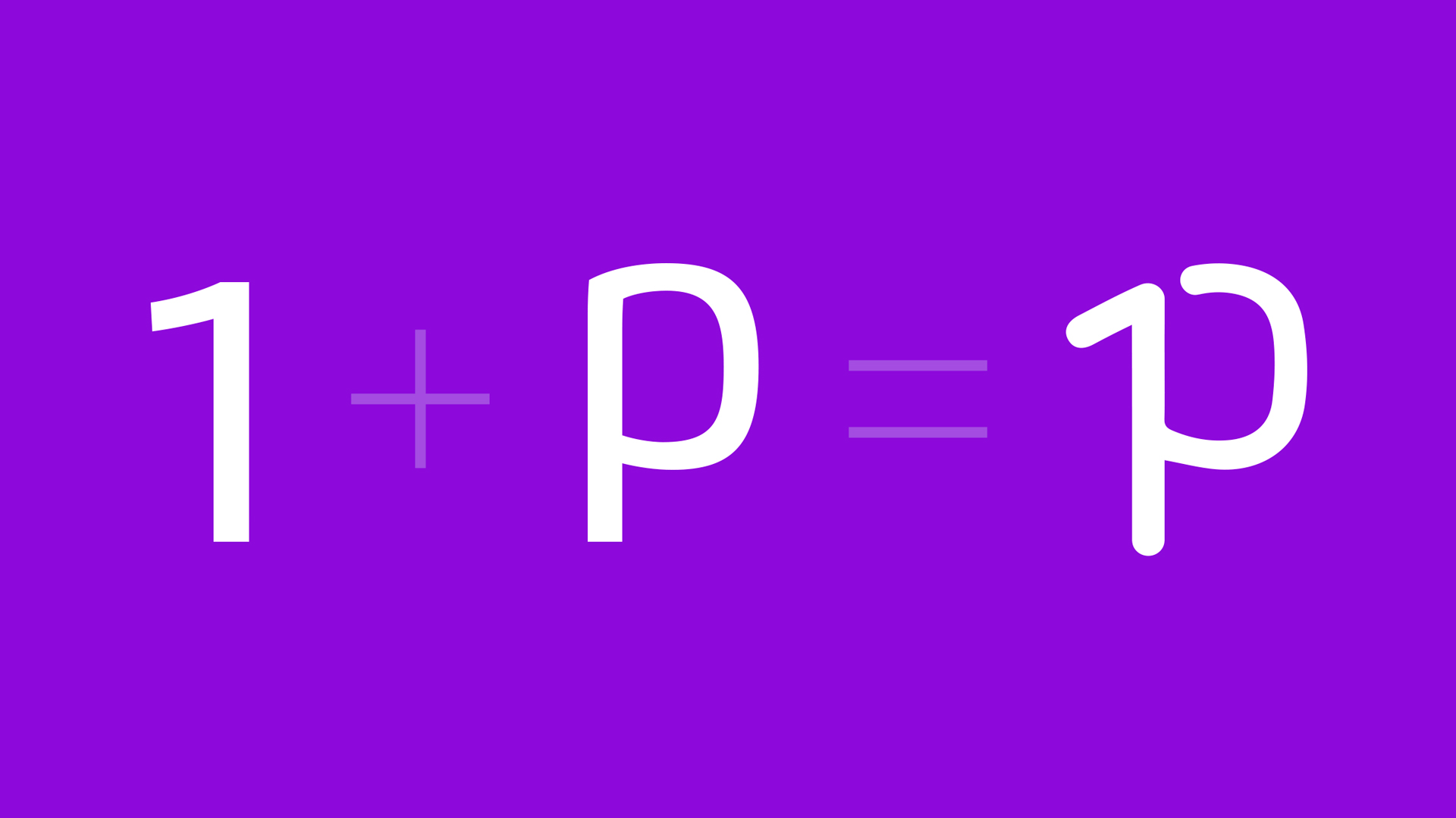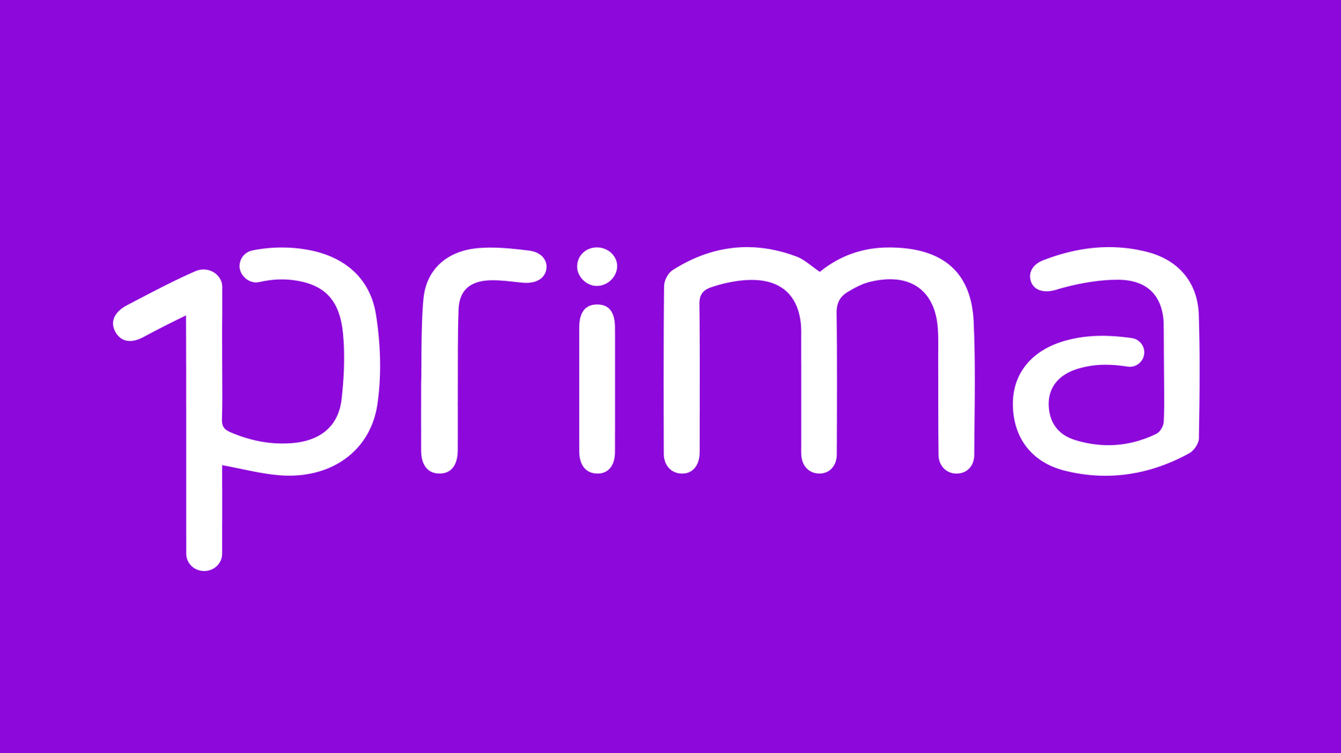
The Prima brand was born from a number that the word recalls, the number one, the first. We have integrated the numeral into the bisyllable of the word ‘first’ by exploiting the descending stem of the initial letter p and revealing the number by means of a delicate graft.
A virtuosity, we might say, but also a bit of graphic luck if ever there was one. The end result is a linear and readable design, a logotype with a discreet characterisation. Completing the identity is purple, which results from the combination of the symbol colour of action, red, and technology, blue.
Our brand identity project dates back to 2014, has remained unchanged and distinguishes the brand in its run.


What we did for this brand
Visual identity design
Planning a new project? Call us.