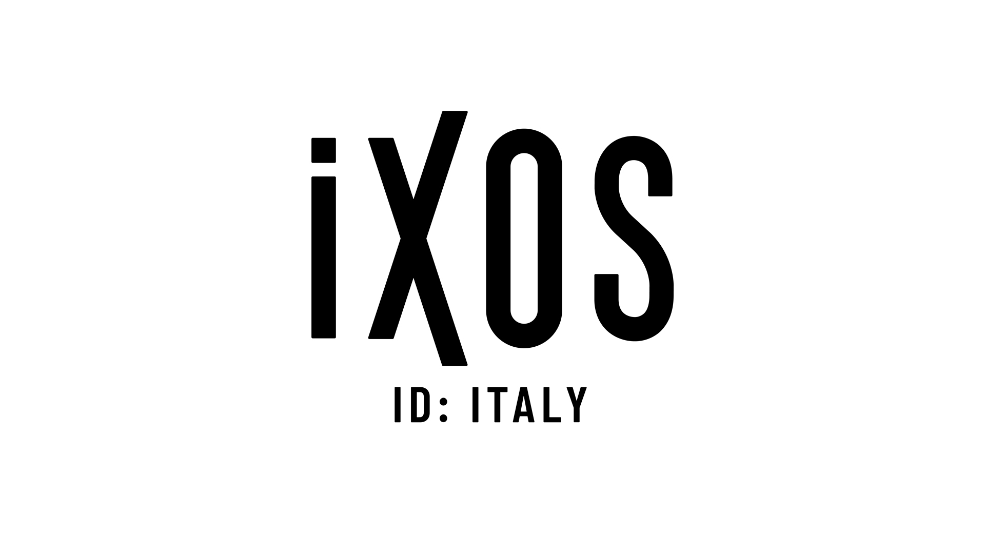
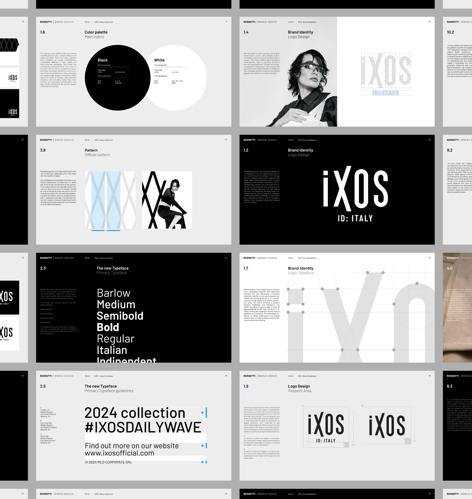
Ixos is a fashion brand. It is dedicated to those who have a strong and stylish attitude in life, so declares the promise of Ixos. We at Rossetti Brand Design took care of the new visual identity. The revision project developed from an idea of linearity already inherent in the brand’s style. It thus evolves from the previous identity to take on a less organic and more geometric appearance while retaining a fluid perception given by the variable relationships between the letters of the logotype.
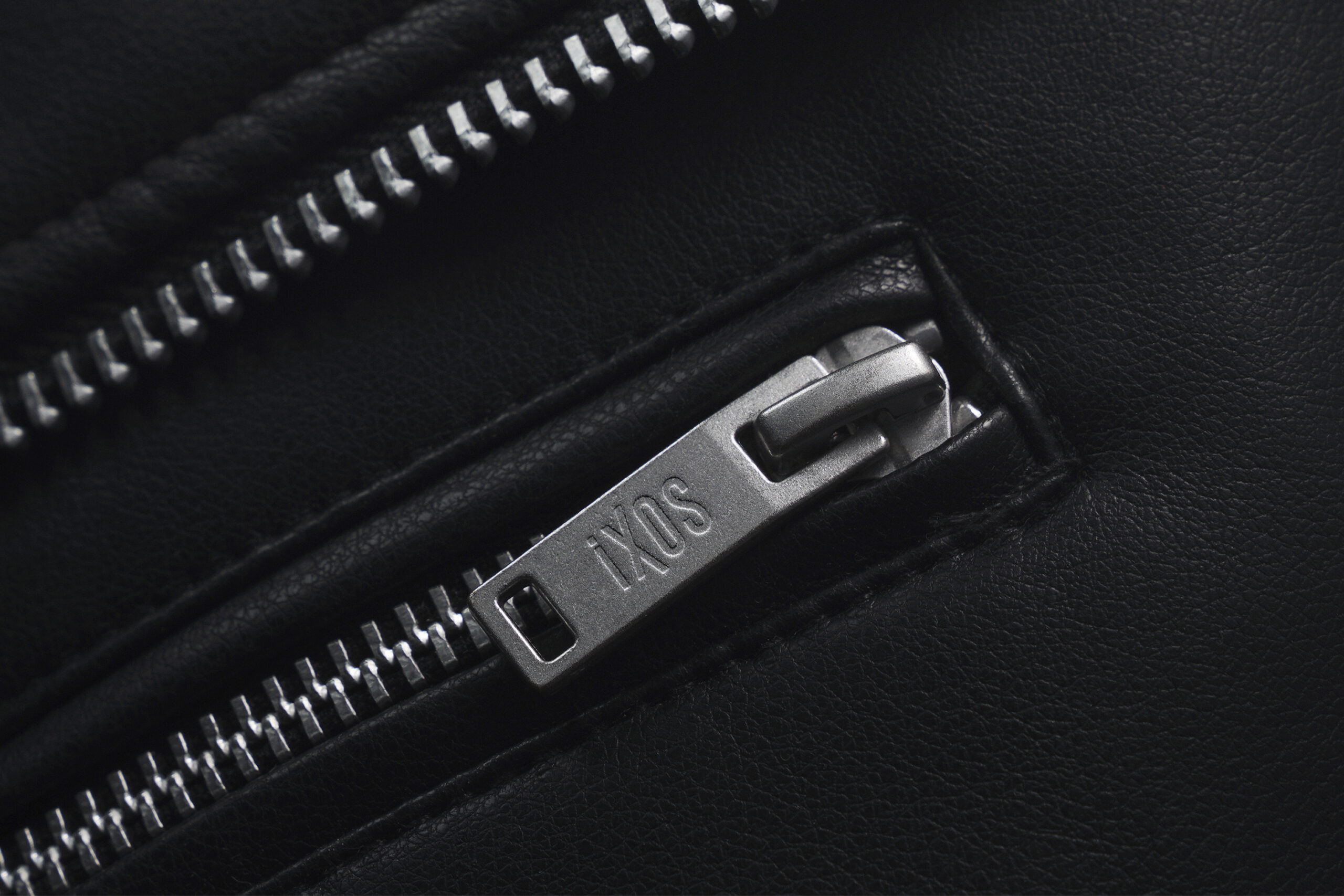
Each letter approaches the others not through strict alignment but with a mobile aspect evoking a language of possibilities, the letter X in particular alludes to the intersections of paths and, in the broadest sense, of human experience.
In the construction of the letter X, symmetry is disregarded in the stretches that soar upwards and in the opposite direction. The end result is accurate but with an inherent dose of fickleness.
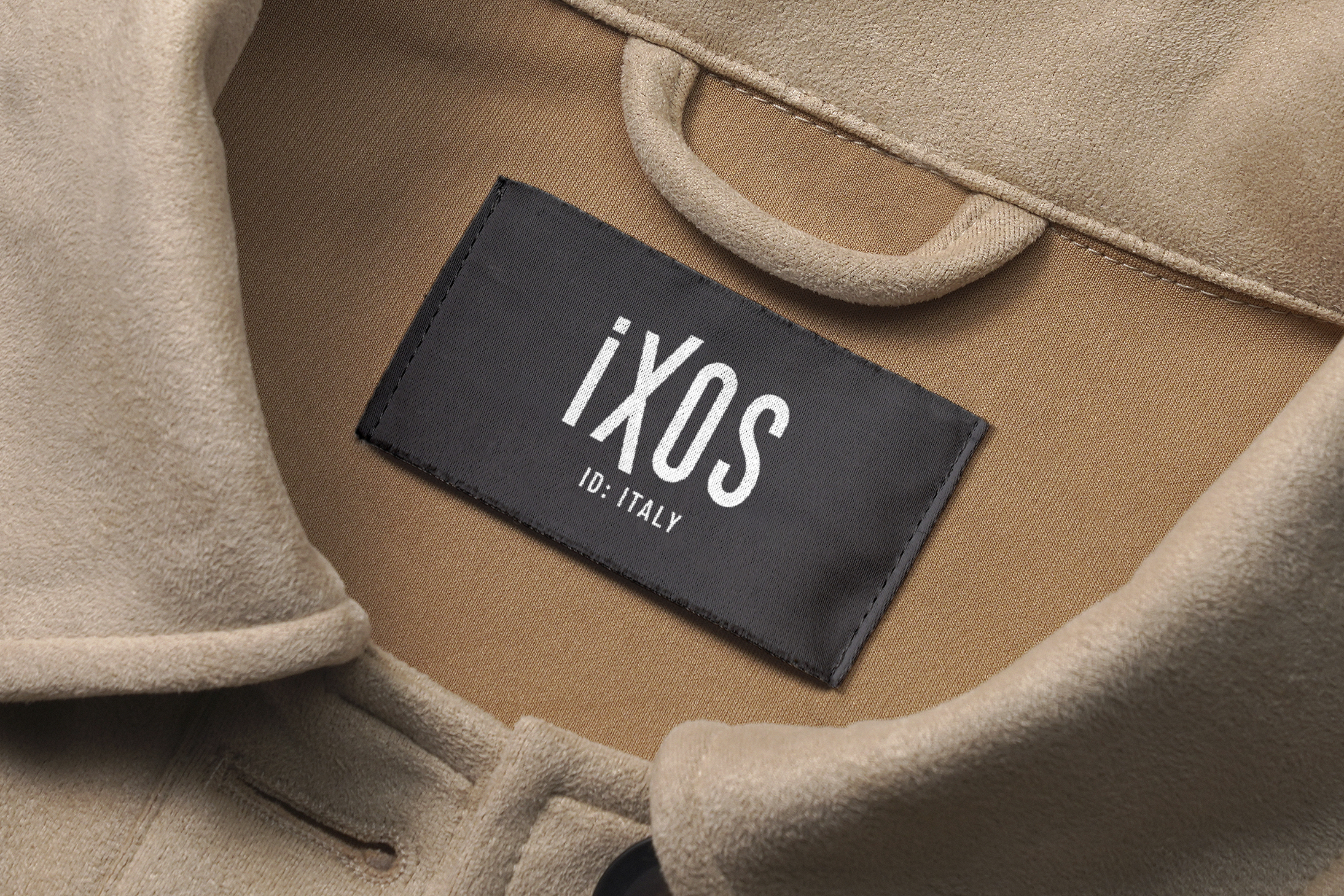
The visual identity of Ixos is completed with the pay-off that recalls the Italian identity (ID) in synthesised mode. The colour system only indulges in black and white.



What we did for this brand
Visual identity redesign
You might like